Melbourne Storm logo and symbol, meaning, history, PNG
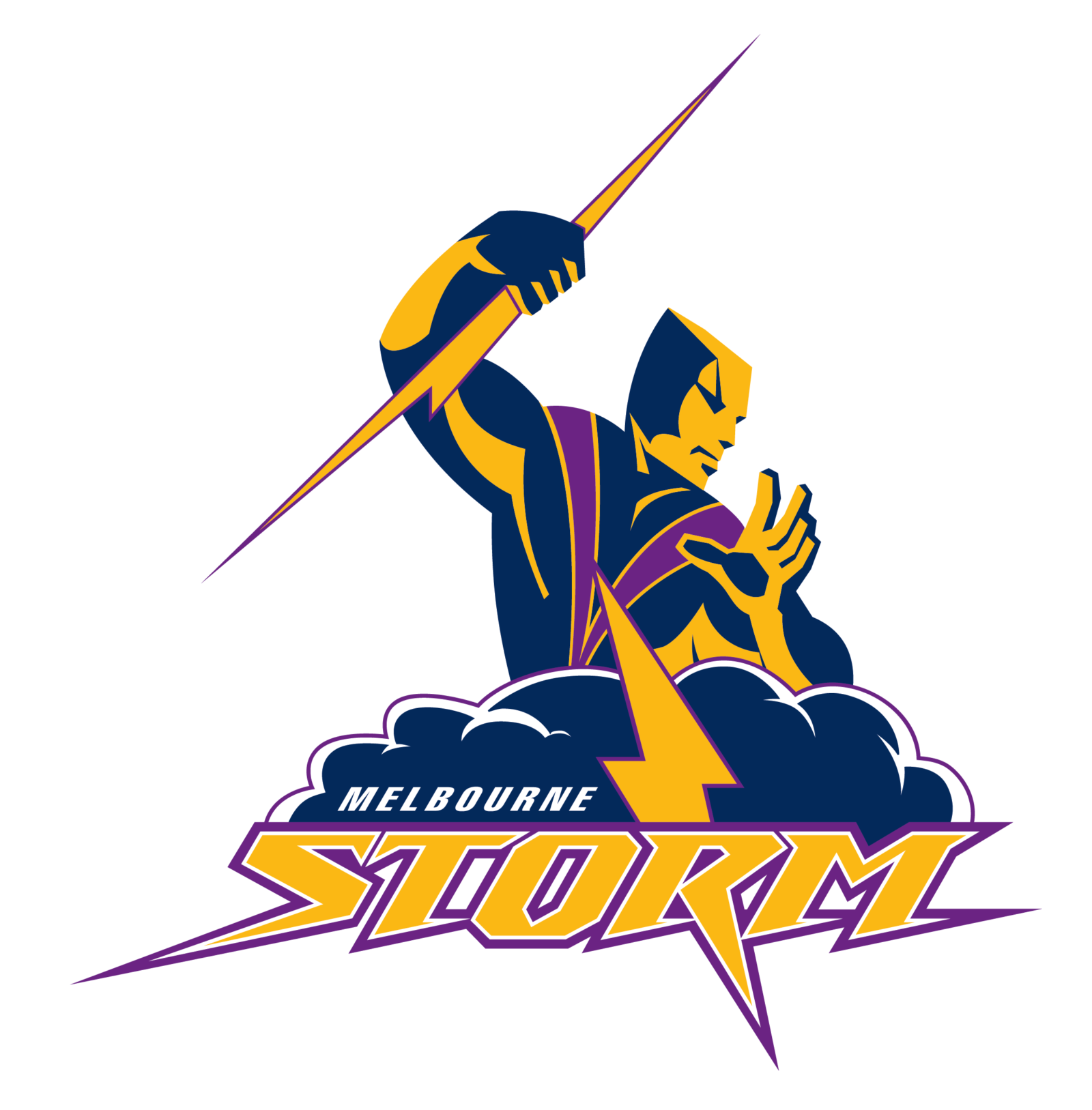
- The brand identity has always preserved its three core values: the color purple, the depiction of Storm man, and the lightning bolt.
- Here, we also see the iconic Storm man, although the design is more complex.
- The Storm man’s torso goes out of a navy cloud, which appears to be boiling.
- Before adopting the Storm man logo and the name Melbourne Storm, the cofounders were going to name the club Melbourne Mavericks.
- The initial brand identity supposed a completely different logotype – it featured a gunslinger with a fistful of dollars.
- However, they received a recommendation from News Limited’s Lachlan Murdoch, who told they should develop another brand identity as this one sounded too American.
- Among the multiple ideas discussed were Trams and Flying Foxes.
- 2018 On 17 October 2018, the 20th Anniversary logo was unveiled depicting only the torso of the Storm man and the name of the team in a different font.
- The design was placed in a shield with the lettering “20 years.” 2018 — Today The anniversary shield was transformed into a new team logo.
- They also received a recommendation from the JAG fashion house’s Peter McWhirter, the club consultant, who told they could make the brand identity more eye-pleasing by using purple and gold.
- The four colors were used from 1998 to 2004.
- In 2010-2012, the gold returned, the gray disappeared, while the purple became the dominant color in the jersey.
- Gone were the gold and most of the white, while the lightning bolts grew purple.
- In addition to the purple, which has been associated with the Melbourne Storm logo ever since the team was introduced, the current emblem also features navy, gray, and white.






Leave a Review