Massimo Dutti Logo
- Download PNG Massimo Dutti Logo PNG Massimo Dutti is a Spanish fashion brand of quality clothing and accessories, which was established in 1985 by Inditex Group, which is one of the world’s largest and strongest players in the fashion retail segment.
- Meaning and history 1985 – 1990 Massimo Dutti is a prestige brand, oriented for mid- and upper mid-class clientele.
- The brand’s designs feature elegant silhouettes and calm classic colors.
- If the previous logo could speak, it would say “classic elegance.” You can see refined glyphs of classic proportions with small but visible serifs.
- The letters are white with a black outline.
- On the top, there is the word “Massimo” separated from the words “Massimo Dutti” below by a horizontal bar.
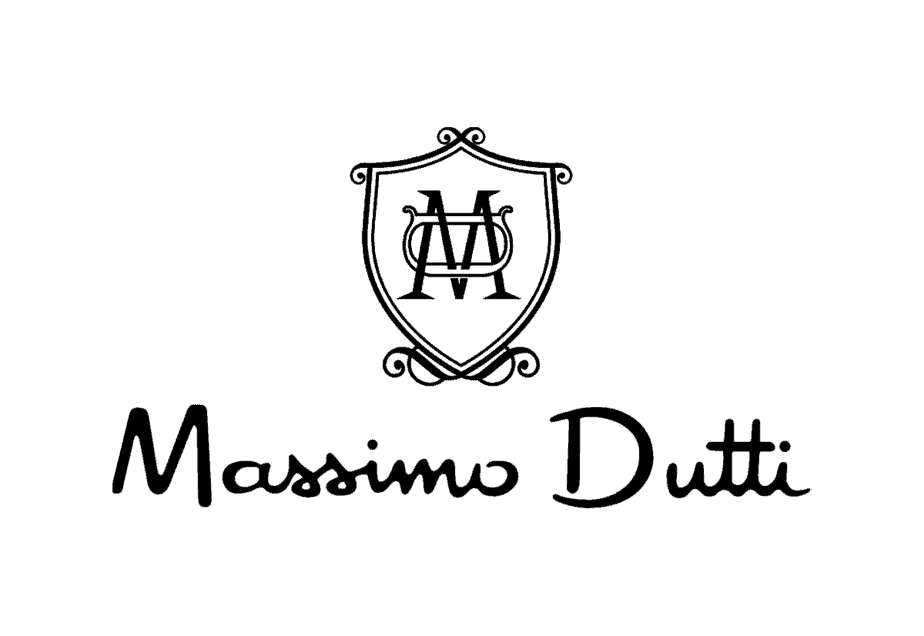
- 1990 – Today The Massimo Dutti visual identity is modest, yet very recognizable.
- As the majority of fashion labels, the brand features a simple monochrome logo, comprised of a single wordmark.
- The wordmark is executed in a handwritten cursive typeface with smooth rounded lines.
- It has a retro-style character, but the first letters “M” and “D” look modern and confident.
- The wordmark is perfectly spaced and makes the logo look harmonized and confident.
- The black color of the lettering elevates the logo, making the brand look powerful and evoking a sense of expertise in design and quality.
- The Massimo Dutti logo is a perfect signature for such a successful brand, which values style and high-quality fabrics.
- It is timeless and sleek, making the label look luxurious.





Leave a Review