Mary Kay Logo
- The founder’s son is the chairman.
- It was founded by Mary Kay Ash.
- By the time she established her company, she already had a 25-year experience of direct selling for other companies.
- Her example has been a great source of inspiration for women around the globe.
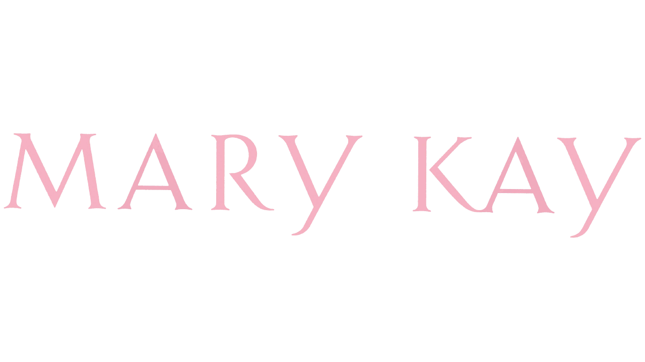
- While it may look pretty simple, at first glance, in fact, it is refined and unique.
- This may appear especially strange if you take a look at all the other letters – none of them form such a glyph, even the “M” and “A” or the “A” and “R,” which have their lower serif positioned in a way that would have made this approach easy to use.
- Another thing that makes the type unique is the way the “median” elements in the letters are positioned.
- For instance, the “A’s” have rather low horizontal bars, while the end of the “R” starts rather high.
- Interestingly, the end of the “Y” also starts rather high, while its end is pretty short.
- The transition from the glyph to the serif forms an attractive curve.
- A little more sophisticated version features the lettering in a rose gold tone over the black background.
- For instance, the one with a rose icon.
- While you can also find a variety of versions based on other typefaces, they do not hold the status of the official Mary Kay logo.
- 1967 – Today The current Mary Kay logo is an example of a simple yet elegant design.


Leave a Review