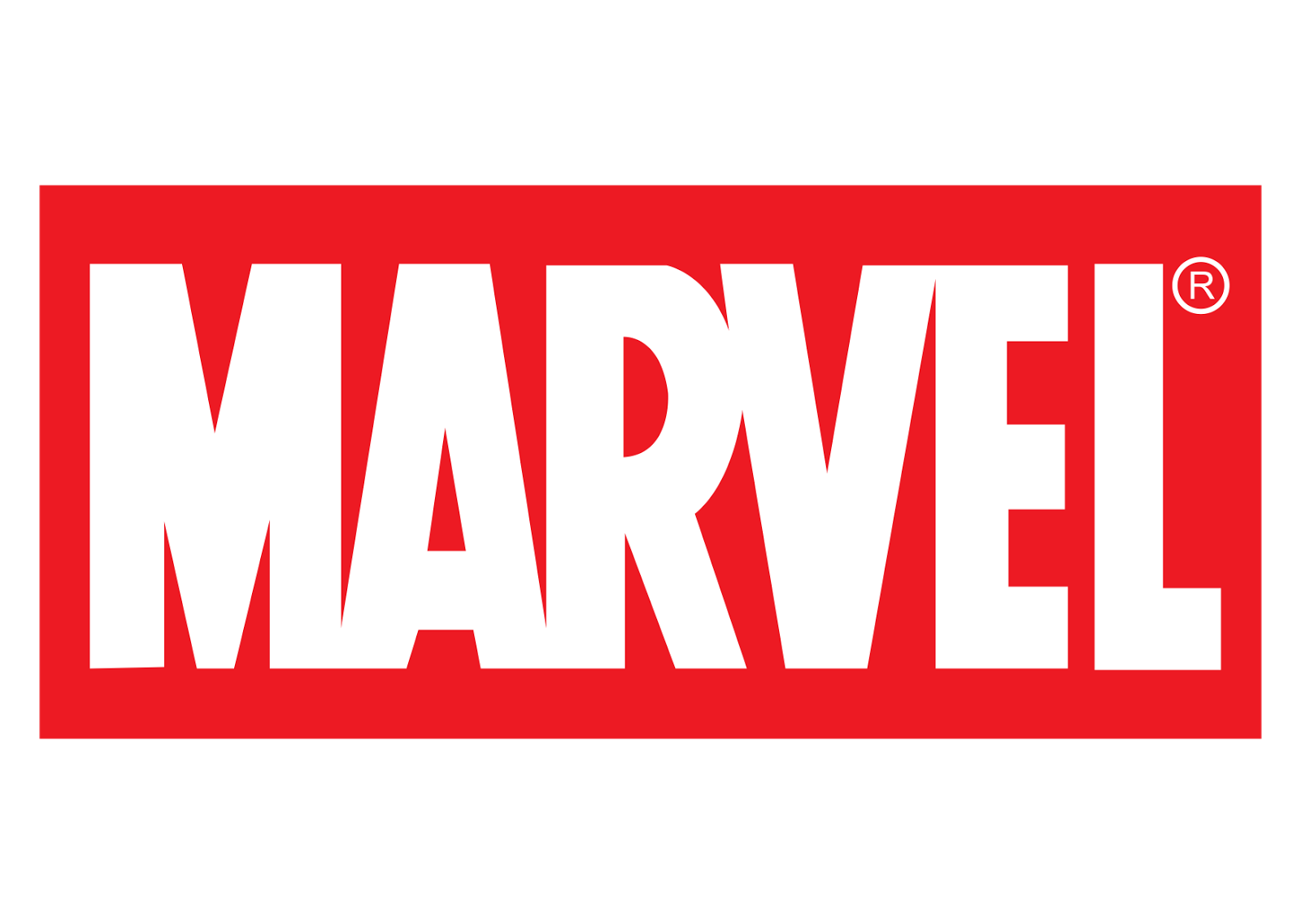
Marvel logo and symbol, meaning, history, PNG
- It was placed inside a shield shape.
- The 1951 logotype reflected the change of the company name to Atlas Comics.
- Throughout the years the tagline was changed and placed in and out of the main badge, though its red rectangular emblem with the white lettering has never been changed since 1993 – 1996 1996 – 2002 2002 – 2008 2008 – 2013 The logo, created for Marvel in 2008 featured an iconic scarlet-red rectangle with w narrowed white sans-serif lettering on it.
- The bottom part of the badge featured two thick parallel lines and the word “Studios” between them.
- The inscription in all capitals was executed in a lightweight expended sans-serif font with symbols placed far from each other.
- 2013 – 2016 The redesign of 2013 placed the “Studios” part under the main badge, writing it in black and putting in a white background without any framing.
- The typeface of the tagline was also changed, and now the inscription was set in a lightweight square typeface with clean straight lines.
- 2016 – Today The logo for Marvel Studios we all can see today was introduced in 2016 and featured a horizontally stretched rectangular badge, which is vertically divided into two equal parts — the red with “Marvel” inscription on the left, and the white with the “Studios”, written in black narrowed sans-serif, on the right.
- The inscription from the right part is placed between two horizontal lines, which are also black, and looks professional and stylish.
- Emblem With each modification, the Marvel wordmark was getting closer and closer to its modern look.
- The latest modification took place in 2012.
- It was quite a subtle update hardly noticeable unless you compared the two versions side by side.
- Font The typeface looks very close to the font called Benton Sans Extra Comp Black font.
- Color The bright shade of red featured in the Marvel logo creates an excellent background for the white lettering.




Leave a Review