Contents
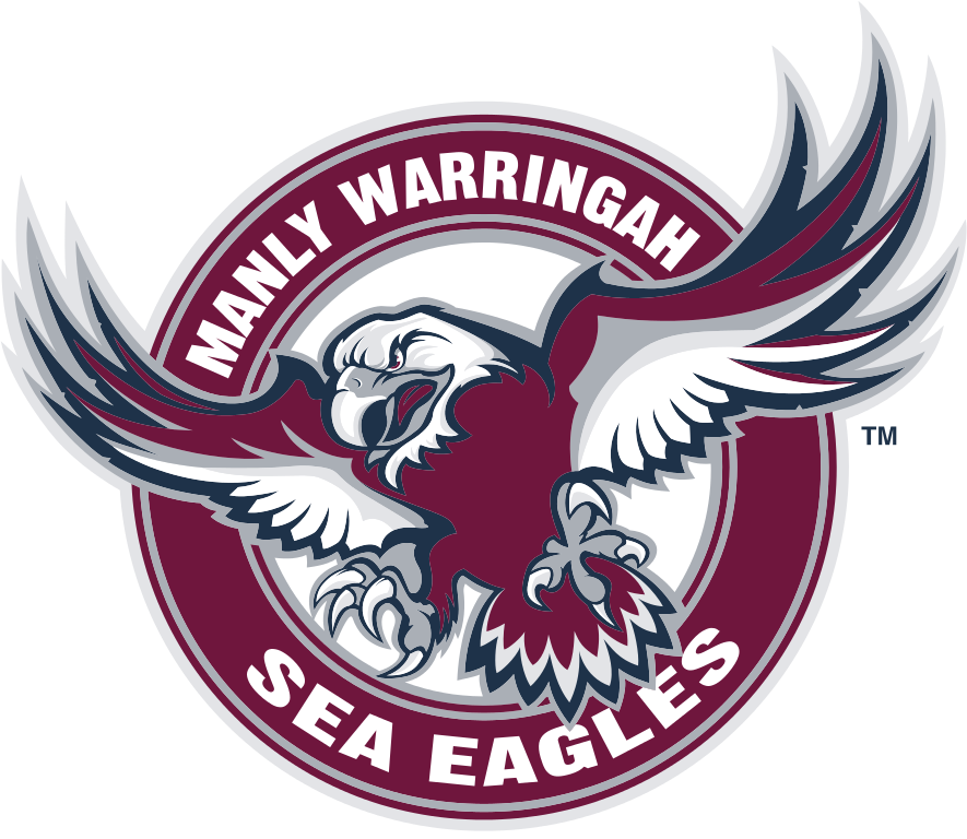
Manly-Warringah Sea Eagles logo and symbol, meaning, history, PNG
- Download PNG Manly-Warringah Sea Eagles Logo PNG Meaning and history 1947 — 1955 In 1946, Manly Warringah was admitted to the NSWRL first grade competition.
- The earliest Manly-Warringah Sea Eagles logo made its debut in the early 1950s.
- It was a white shield with a thin maroon outline.
- The shield housed the letters “M” and “W,” which were given in a plain sans serif type.
- 1956 In 1956 the calm and boring logo was changed to a delightful and modern emblem, where the burgundy and white eagle with smooth contours was placed on a solid yellow circle.
- The bird was sitting on a burgundy ball with a bold “MW” monogram on it.
- The letters were executed in extra thick lines and evoke a sense of power and confidence.
- 1957 — 1959 The logo adopted in 1957 was somewhat ambiguous, and due to this the team was often mistakenly referred to as the “Seagulls” instead of the official “Sea Eagles.” 1960 — 1977 To avoid the misconception, they had a logo redesign in 1960.
- The bird looked more like an eagle now.
- 1978 — 1979 Eventually, in 1978, the crest featuring a detailed depiction of the eagle was adopted.
- 1998 — 1999 The 1998 logo was even richer with details, but it also looked somewhat cluttered and had a cartoonish feel.
- 2003 — Today The simplified palette of the 2003 crest looks nobler.
- Colors Ever since the club entered the competition, it has used the combination of maroon and white for the logo.
- At some points, other colors were added to the Manly-Warringah Sea Eagles logo.





Leave a Review