Manchester City logo and symbol, meaning, history, PNG
- Download PNG Manchester City Logo PNG Manchester City Football Club was created in 1880 as St. Mark’s and adopted its current name in 1894.
- 1894 — 2011 After the organization of Manchester City FC, the club embraced an official Manchester coat of arms as its main logo.
- The coat of arms was composed of an orange shield with three yellow oblique lines on it.
- The upper part of the shield portrays a clipper placed on a white and blue background.
- The orange and yellow shield was placed on a light blue background and encircled in a thick white-and-black circular frame with a black sans-serif inscription around its border.
- The clipper on this emblem was also executed in yellow and placed on a white and orange background.
- 1970 — 1972 In 1979 the logo was redesigned again.
- All patterns were modified and the color palette was shifted to a more enthusiastic one, making the framing light blue and the wordmark — gold in a black outline.
- As for the main part of the insignia, the shield, it got modernized, and now the lines were bolder and more balanced, as well as the clipper, put on a white background with wavy yellow lines.
- 1972 — 1976 A red rose appeared on the shield in 1972, replacing the diagonal lines.
- Now the shield, outlined in gold, was placed on a light blue background and featured a bold sans-serif lettering in a modern and massive typeface around the white frame’s perimeter.
- The blue shield with three white diagonals was placed on the body of the golden eagle, who had its head turned to the left.
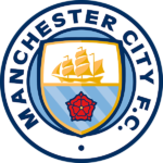
- 2016 — Today In 2016 Manchester City decides to come back to the version of the 1990s, returning the rounded badge and a red rose.
- The shield in a double blue and gold outline featured the clipper in gradient gold and a red rose on a blue striped background.
- The wordmark in royal blue is placed around the edge of the circular frame, executed in a modern and solid sans-serif typeface.
- It featured a goat and a lion in a red crown beside a shield shape.
- Current emblem The 1997 badge received a lot of criticism from the team’s fans, so it was only natural that the club changed it less than 10 years after it was introduced.
- The image somehow resembles logos of other clubs belonging to City Football Group.
- Font The sans-serif all-cap typeface used in the current version of the Manchester City logo looks clear and minimalistic.
- Color The team’s home colors are light blue (often referred to as sky blue) and white.





Leave a Review