evolution history and meaning, PNG
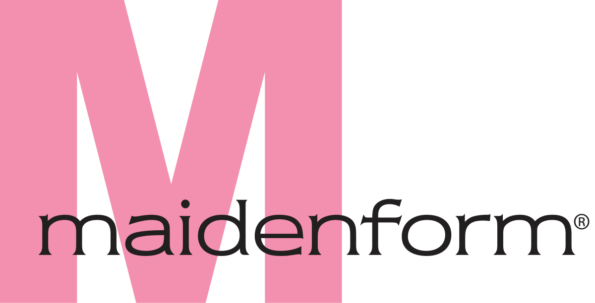
- Download PNG Maidenform Logo PNG In addition to featuring the company name, the Maidenform logo is also evocative of the brand’s most known product, the bra.
- Meaning and history The history of the brand can be traced back to 1922 when Ida and William Rosenthal in collaboration with Enid Bissett started making brassieres.
- The original name of the brand was written in two words (Maiden Form).
- However, the company was incorporated under the name of Enid Manufacturing Company (1925).
- 2005 – 2011 The structure was pretty similar to the current logo.
- There was a large pink “M” paired with the lettering “Maidenform.” This time, however, it was written across the “M” in smaller lowercase sans.
- The “M” looked heavier and simpler than the current version, while the name of the brand, on the contrary, featured a more elegant type than the current wordmark.
- Yet, the most important difference was that the “M” looked just like the “M,” not the bra, which made the old Maidenform logo less meaningful than the current one.
- 2012 – Today The logo is dominated by a large “M” in magenta.
- The word “Maidenform” placed below features a light, airy sans.
- We can add that there is a slight legibility problem.
- The reason is not the choice of type but rather the fact that the name of the brand is rather long – much longer than an average word.
- In logo design, this problem is sometimes resolved by breaking the word down into easier-to-digest parts, for instance with the help of the color, the font (bold and light) or capital letters.
- And yet, if the design forces behind Maidenform had used one of these approaches, this could have stolen the limelight from the “M.”


Leave a Review