Maggi logo and symbol, meaning, history, PNG
- Download PNG Maggi Logo PNG While the Maggi logo has been updated multiple times, the palette and the style of the typeface have remained the same over much of the company’s around 135-year history.
- 1897 The logo had nothing in common with the current one but the red color and the fact that the word “Maggi” was the centerpiece of the design.
- It was inspired by handwriting and included strokes of various thicknesses.
- There were a lot of elaborate curls.
- 1900 You can already recognize the simple style that is distinctive of the brand’s current packaging.
- The wordmark featured a plain bold sans serif font without any ornamental elements.
- Above, the letter “M” inside a square could be seen.
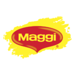
- The background was partly yellow and partly red.
- Nestlé preserved the color scheme and the overall look of the type but made the design simpler and more meaningful.
- The wordmark was now placed inside a red shape, which could be described as a combination of a heart and a drop.
- The drop could be interpreted as a hint on the soups cooked with the help of Maggi products (for instance, its popular bouillon cubes).
- Also, the shape was somewhat similar to a hen’s wattle, the fleshy caruncles hanging from the bird’s head.
- This resulted in a slightly more rounded and friendly style that better fitted the drop shape in the background.
- The type, though, remained a simple sans serif one.




Leave a Review