LuLaRoe logo and symbol, meaning, history, PNG
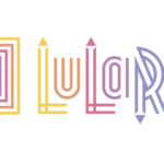
- Download PNG LuLaRoe Logo PNG LuLaRoe logo looks youthful and vivid without being too overpowering.
- It seems to perfectly fit the sphere the brand specializes in – fashion and style.
- Meaning and history One of the very few US designers using MLM, LuLaRoe was established in 2012.
- The number of “consultants” distributing their products reached 80,000.
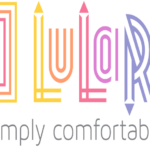
- Regular symbol The logotype consists of three parts.
- First comes a large square with six smaller squares inside.
- Next to it, there’s the name of the company in a fancy typeface.
- The “L’s” have small arrows above them, while the “R” has an arrow below.
- Each of the letters is given in two lines with an empty white space between them.
- Below the square and the company name, there’s a text in lower case: “simply comfortable.” In contrast to the vivid colors of the main part of the logo, the text is given in grey.
- Color The combination of colors featured on the LuLaRoe logo has been definitely “borrowed” from the rainbow, although, unlike the rainbow, the logotype starts with yellow and ends with green.
- In case of each color, a very unusual and pleasing to the eye shade was chosen, as a result of which, the palette became unique and eye-catching.
- Font The wordmark is a custom artwork, although its author might have used several existing fonts as a source of inspiration.
- The company recommended three fonts for its consultants to use in documents or web pages connected with LuLaRoe: Exljbris, Maven Pro Light, and Steelfish RG.




Leave a Review