London Underground logo and symbol, meaning, history, PNG
- Meaning and history 1908 – 1913 The very first logo for London Underground was created at the beginning of the 20th century, in 1908.
- So the initial badge featured a stylized black and white lettering in the uppercase, where the first and the last letters were enlarged.
- 1913 – 1919 The redesign of 1913 added the element, which became the most recognizable in the London Underground visual identity — a solid red circle.
- It was placed in the background, behind the train wordmark.
- 1919 – 1933 In 1919 the badge was refined and outlined in thin white and blue.
- The letters were all in white and set in a navy blue background.
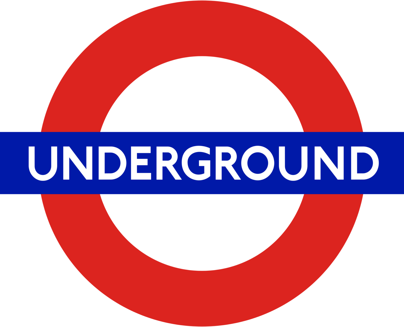
- 1933 For a few months in 1933, the Underground badge looked like a white circle outlined in bold red rounded, with a dark blue and white wordmark banner crossing it horizontally.
- Above the logotype, there was a blue “L.P.T.B.” Inscription in medium-thickness lines of a traditional sans-serif typeface.
- 1949 – 1951 In 1949 the “Underground” inscription was replaced by the “Railways” in all capitals.
- 1951 – 1958 Both the rounded and the rectangular banner’s outlines were removed in 1951.
- 1958 – 1969 In 1958 the “Underground” got back to the logo.
- The first and last letters of the uppercase wordmark were still enlarged, but the square frames and thick horizontal strokes were absent on this version.
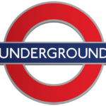
- The “Underground” in all capitals was written in a classic medium-weight sans-serif typeface, in white color over a bright blue horizontally stretched rectangular badge, which was crossing a scarlet-red rounded.
- 1972 – 1985 The badge, introduced in 1972 and used by the underground for more than a decade, was, probably, the most interesting one.
- It was all red and white, with no lettering at all.
- The blue rectangular banner was replaced by the red one, and as it had no framing, the banner merged with the rounded and had both sides coming out of the circle.
- 1985 – Today The well-known roundel first appeared on the platforms in 1908.
- The red bar and circle has been the main part of the London Underground logo ever since.
- Font and color The uppercase “Underground” inscription on the London Underground logo is executed in a clean and neat sans-serif typeface with distinct contours, thick lines, and stable shapes.
- This combination also stands for trustworthiness, good reputation, and value of the company’s clients.





Leave a Review