Losk logo and symbol, meaning, history, PNG
- Two completely dif-ferent symbols were in use by the club during these time periods, but the color palette has always been more or less the same — the club has been jumping from French tricolor to just red and white.
- Another common thing for almost all the logo versions is the wordmark.
- 1944 — 1946 The initial logo for the Lille football club was introduced in 1944 and featured a bold red shield with a white Fleur-de-Lys symbol in a delicate black outline.
- O. S. C.” Wordmark was placed on the top part of the shield, which was now colored light blue.
- The letters were colored white and executed in a bold sans-serif typeface, each letter and dot was outlined in black.
- The intense red color came back to the logo, bringing while and blue with it.
- The “LOSC” lettering without any dots was arched along the bottom part of the shield and executed in an ExtraBold rounded sans-serif font with the letter “O” replaced by a black and white football.
- It was a cool and eye-catching emblem, which has put a dot in the Fleur-de-Lys symbolically for Lille Olympique.
- 1981 — 1989 The red bulldog became the symbol of the club in 1981 and stays with them today.
- The dog with blue details was enclosed in a thin blue circular frame and placed on a white background.
- All the blue details except for the circular frame were removed, but the dog gained two sleek and sharp lines behind its back, resembling wings and symbolizing speed and freedom.
- The “LOSC” part with no dots was executed in italicized ExtraBold sans-serif typeface, in a light blue color, and the “Lille Metropole” in gray was placed under it, in delicate clean lines.
- The red bulldog was redrawn in a more modern and sleek way and placed above the red “LOSC” wordmark in a double white and blue outline.
- The “Lille Metropole” tagline was colored blue and had a red delicate fleur-de-lys symbol separating the words.
- 2012 — 2018 The emblem of 2012 is the most elegant and sleek among all the Lille Olympique logo versions.
- On the blue part there is a delicate fleur-de-lys, and on the red — and iconic bulldog, which overlaps the left part, forming kind of a red flame.
- The lettering above the shield featured arched “Lille” in a serif font, and bold gradient red “LOSC” in the same style, but with thicker lines.
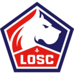
- 2018 — Today The redesign of 2018 brought a more aggressive image to the club’s visual identity.
- The “LOSC” lettering in the masculine font is placed on the bottom part of the emblem and has a small and elegant fleur-de-lys symbol above it.
- Lille Olympique Colors RED PANTONE: PMS 485 C HEX: #E01E13 RGB: (224, 30, 19) CMYK: (6, 99, 100, 1) BLUE PANTONE: PMS 2119 C HEX: #24216A RGB: (36, 33, 106) CMYK: (100, 100, 27, 16) WHITE HEX: #FFFFFF RGB: (255, 255, 255) CMYK: (0, 0, 0, 0) Video





Leave a Review