Liberty Bowl Logo
- This can be partly explained by the fact that the sponsor, Memphis-based auto parts retailer AutoZone, has also remained the same.
- The Liberty Bowl emblem, used from 1993 to 1997, featured a smooth and fresh blue and white color palette with some delicate red elements.
- All elements featured calm blue as the main color but had some thin details (stripes and crack on the bell and square confetti over the wordmark) in white and yellow.
- The slanted “ST Jude” in a traditional sans-serif was written in white over the upper part of the bluebell.
- The bell moved to the left from the lettering and got enclosed into a horizontally oriented rectangular frame in red.
- Above the emblem and the inscription, there were two solid geometric figures: a blue square with the white “AXA” logo, and a horizontally stretched red rectangle with the thin white serif “Equitable” written on it in the uppercase.
- 2000 – 2003 The framing is gone and the bell becomes the main element of the logo again in 2000.
- The color palette remained untouched, but everything else was changed.
- Now the AXA emblem was set over the bell, enclosed into a medium-weight white square frame.
- The “St Jude” in the title case moved back to the top of the bell but changed its typeface to a simple yet bold sans-serif.
- As for the “Liberty Bowl”, it was now set in one line, with its capitals executed in a modern yet simple sans-serif typeface, in the same shade of blue, like the one used for the bell.
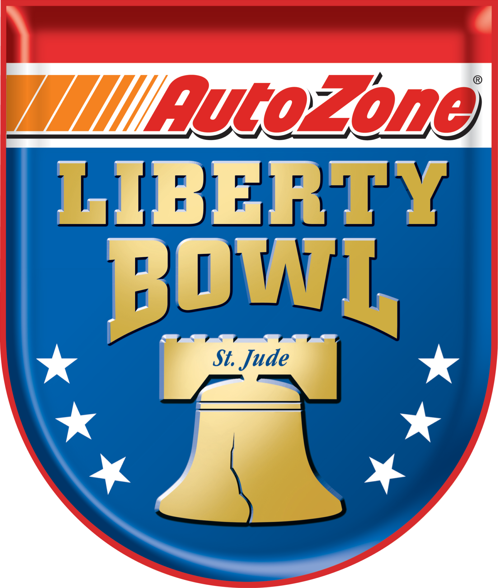
- 2004 – Today A three-dimensional badge in the new color palette was introduced in 2004.
- The gradient blue crest had its upper part in red and white, with AutoZone logotype following the geometric orange graphical emblem on the left.
- As for the blue part, it boasted a gold logotype with the up line straight and the bottom one arched above the golden Bell with the blue “St Jude” written in cursive along its upper part.




Leave a Review