LG logo and symbol, meaning, history, PNG
- Download PNG LG Logo PNG LG is based in South Korea, but its products are sold in more than 75 countries all around the world.
- 1947 — 1995 The original logo of Lucky was composed of a red and white emblem and a black inscription in Korean on its right.
- The emblem featured a solid red square with a stylized white letter “L” on it.
- 1980 — 1995 In 1980 the GoldStar logo was redesigned and changed its color palette to dark red and white.
- The wordmark was also redrawn and now was executed in a modern sans-serif typeface with bold soft lines.
- The logo for Lucky-GoldStar was composed of a square red emblem with the Lucky “L” on it and a white GoldStar crown placed above the zig-zag bar.
- The logotype was written in Korean and featured black color and straight sleek lines.
- The company kept its name and emblem until 1995.
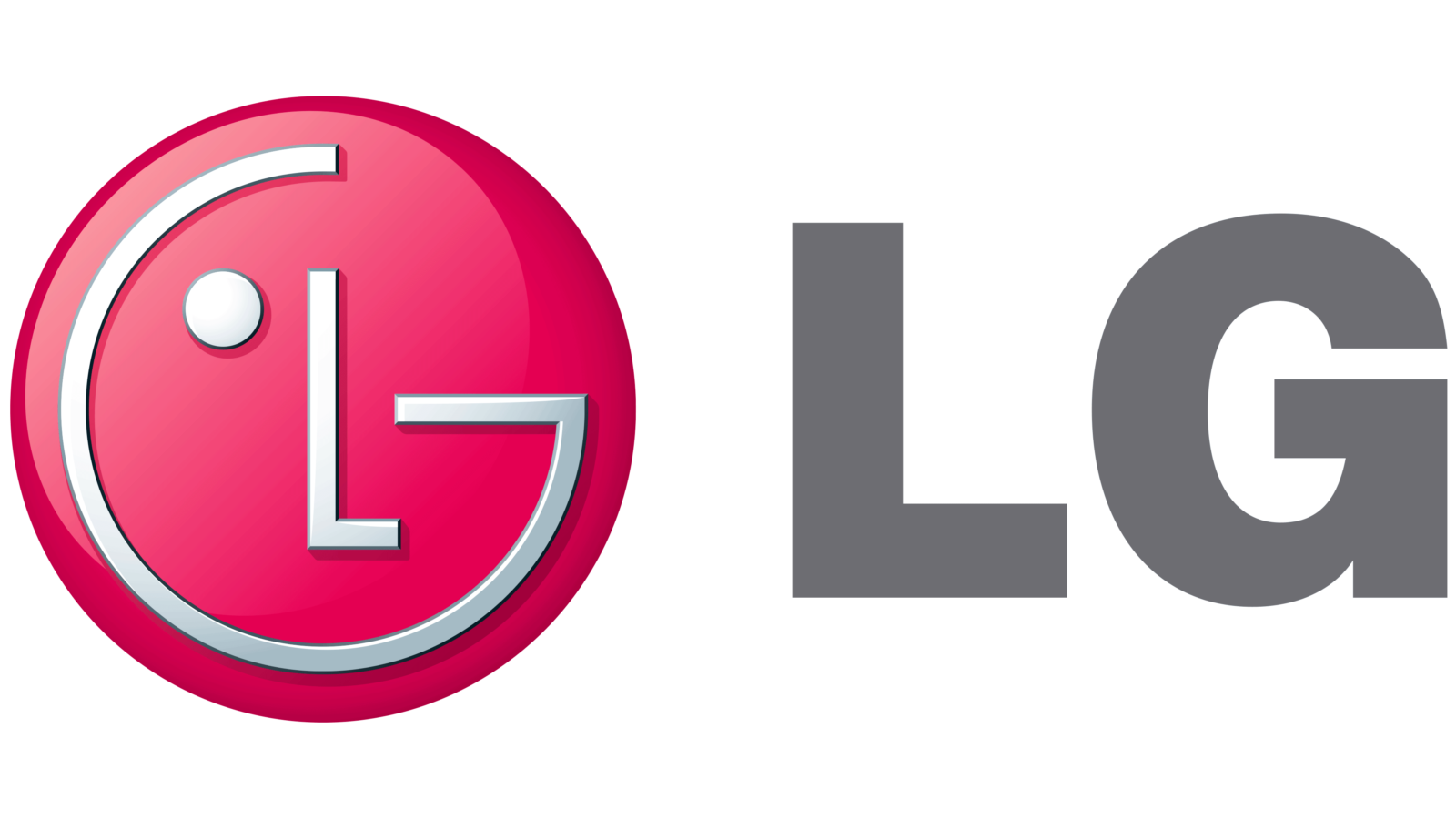
- The new logo featured a circular red emblem and a light-gray wordmark on its left.
- The lettering was executed in a bold Helvetica font and looked simple and modest near the bright and creative image.
- The red (closer to fuchsia) circle had three white symbols on it — the “G” drawn around the inner perimeter, “L” placed in the center, and a solid white dot, located on the left from “L”.
- The composition of symbols created a stylized face image.
- As for the lettering, it changed its typeface to a more modern one, though kept dark gray as the main color.
- Symbol The center of the logo is a circle, inside of which stylized letters “L” and “G” are placed.
- Next to the circle, there is the name of the company in a simple, minimalistic type.
- 3D emblem There are two versions of the LG emblem.
- Color There are three elements in the LG logo color scheme.
- The brightest color is the dark shade of red that the company refers to as “the unique LG Red color”.
- Inside the red circle, there is a stylized name of the company given in white.
- There’s also the LG Grey color used for the characters next to the emblem.


Leave a Review