Leroy Merlin Logo
- Download PNG Leroy Merlin Logo PNG Leroy Merlin is a French brand of household goods, decorations and gardening products retailing company, which was established in 1923 by Adolphe Leroy and Rose Merlin.
- The brand is popular in European countries as well as in Asia and South America.
- Meaning and history 1968 – 1980 The very first logo for Leroy Merlín featured a text-based emblem with the narrowed sans-serif lettering and only one full-sized letter “O”, which had a stylized image of the lady’s silhouette inside.
- The inscription was executed in a bold geometric font with straight lines and distinct angles.
- The color palette used for the original logo of the company was black and white.
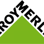
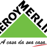
- 1980 – 1996 The redesign of 1980 brought to the Leroy Merlín visual identity the image we all can see today — a solid green triangle with the black lettering placed along its diagonal sides.
- The inscription was set in a bold stencil serif font with thick lines and smooth massive serifs.
- 1996 – Today Brand, named after its two founders, has a simple and strong visual identity.
- The Leroy Merlin logo is composed of a triangle with a wordmark placed on its two sides.
- The bright green triangle, standing on its base is a symbol of stability and confidence, while its pleasant green color represents harmony, balance and growth.
- The Leroy Merlin wordmark is executed in all-caps in a traditional sans font, with clear and confident lines.
- The black color of the letters adds authority and power to the logo.
- The Leroy Merlin logo is minimalist and laconic, yet says everything about the brand — it reflects success, progress and passion, while evoking a sense of security and expertise in quality and design.
- It is a very strong visual identity for a company with a good reputation.


Leave a Review