Las Vegas Bowl Logo
- Meaning and history 1996 The Las Vegas Bowl logo, created in 1996, was executed in a patriotic blue and red color palette, with the lettering written in two levels and two completely different styles.
- The upper line, “Las Vegas”, was set in calm red color, using an elegant serif font with softened contours and a thin blue shadow.
- The levels were separated by a very thin red horizontal line, and the upper part of the logo was decorated by a simple blue and white emblem, depicting a solid rugby ball with a five-pointed star on it and several white and blue lines coming out of the ball to the right, representing speed and motion.
- The palette was changed from the traditional tricolor to juicy yellow and orange gradients on a blue and purple background, with red and white rugby ball, flying out of the badge.
- The red rugby ball was slightly refined too, and now got two light blue arched lines coming out of it, which made the ball look like flying rockets as for the logotype, it remained unchanged but got accompanied by one more inscription, the “Sega Sports, new sponsor of the bowl, was written in its corporate style above the gradient orange “Las Vegas”.
- The logotype of the sponsor in white was written over the top part of the logo, which was a solid black circle in a yellow outline.
- The bottom part of the badge was overlapped by a triangular crest in burgundy, with the stylized modern wordmark and sharp yellow-white, and black rays coming out of it.
- 2009 – 2012 Another redesign was made into the Las Vegas Bowl logo in 2009.
- The star was also on its solace in a new blue and yellow palette.
- As for the lettering, the upper part now featured the “Royal Purple” logotype in its corporate style, and the Las Vegas Bowl inscription split into two parts.
- The first was written in red cursive over the light gray background, while the second was set in white bold capitals on a red ribbon, replacing the “tail” of the red rugby ball, flying to the right.
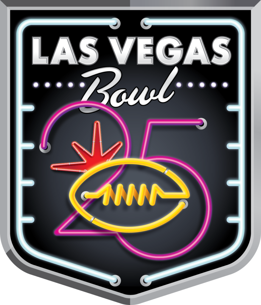
- 2016 For the 25th season of the bowl, the new logo was introduced in 2016, and it was executed in a true Vegas-style — with Neon pipes and black gradients on the background.
- It was a classy crest with gradient white “Las Vegas” in bold sans-serif capitals on top, a diagonally set “Bowl” in cursive underlining it, and the stylized fuchsia pink “25” as the largest element.
- The number was overlapped by a yellow contour of a rugby ball, made of a neon pipe with bulbs on its ends.
- The whole crest was enclosed in a sharp metallic frame from the outside and cold white neon pipes from the inside.
- 2017 The cool yellow rugby ball, which was made up of brine pipes on the logo, designed in 2016, was transferred to the new badge, introduced in 2017.
- The bold sans-serif “Las Vegas” was set under the ball in black and enclosed into a smooth turquoise frame, with the cursive slightly diagonal black “Bowl” overlapping it at the bottom.
- The color palette remained the same, but now with some light gradients, which made the lines look like neon pipes again.
- The yellow rugby ball moved to the bottom of the logo, while the upper part now contained the logotype of the new bowl’s sponsor, Mitsubishi Motors, which was written in its corporate typeface under an enlarged red Diamond emblem.
- The upper part of the logo was also enclosed into a frame composed of turquoise neon pipes, connected to the bottom element.





Leave a Review