Lana Del Rey Logo
- Download PNG Lana Del Rey Logo PNG Lana Del Rey is the stage name of Elizabeth Woolridge Grant, an American singer and songwriter.
- She works in the genre of rock and rock combined with some components of classical music.
- Her songs are often bear glamour and melancholic features and tragic romance themes.
- Having started her career in New York in 2005 at the age of twenty, Del Rey gained wide popularity after the release of her single “Video Games” in 2011.
- Next year, her famous Born to Die brought her international success.
- As of the present time, more than 16 million discs of Lana del Rey have been successfully sold all over the world.
- Logo and its meaning Lana Del Rey does not use any special emblem for the logotype on her records.
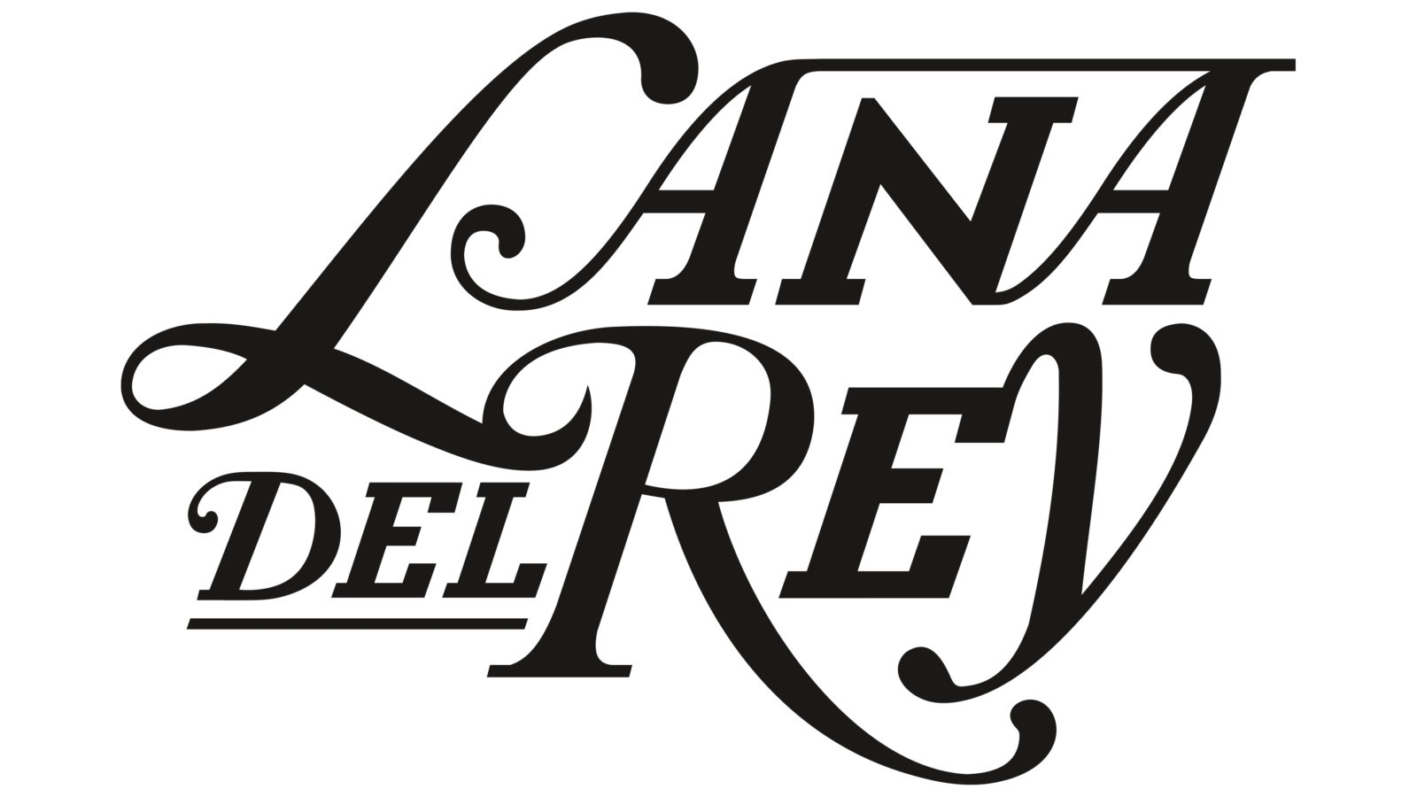
- Her logo is just the wordmark “Lana Del Rey”.
- On the cover of her early albums back in 2011, Lana’s stage name was written in a strict and upright font resembling the commercial Rospi Retro with its narrow and tall old fashioned letters.
- In parallel, there was a playful logo that contained only the abbreviation “LDR” written in block letters on the background of images of a cartoon explosion.
- With the release of the disk “Lust for Life” in 2017, a new logotype was designed.
- This time, the logo had a completely different style.
- The wordmark looks like based on the elegant font Walbaum Pro 06pt SemiBlod Italic but with substantially modified graphics that give it a much more romantic look.
- Extended and curved legs of the letters “L” and “R” as well and the descender of the letter “Y” and the fanciful swashes on the capital letters give the wordmark the features of the American pop culture characteristic for the 1950s and 1960s and that is in line with the romantic and melancholic style of the title song of the album and most of the songs that made up the album.


Leave a Review