Kyrie Irving logo and symbol, meaning, history, PNG
- Download PNG Kyrie Irving Logo PNG Taking into consideration the popularity of Kyrie Andrew Irving as a basketball player, it is hardly a surprise that he became one of Nike athletes to get a signature shoe and, of course, a logotype created by professional designers.
- Meaning and history In fact, Kyrie Irving did have a logo before his “footwear” cooperation with Nike started.
- The logo featured a big red letter “K”, which was somewhere in between an intricate Old English initial and a sleek modern font.
- Symbol When Nike trademarked an emblem combining Irving’s initials in July 2014, the media made a logical assumption the athlete was going to receive a signature shoe from the sports company.
- So, it was only natural that later that year the KYRIE 1 shoe dropped at retail.
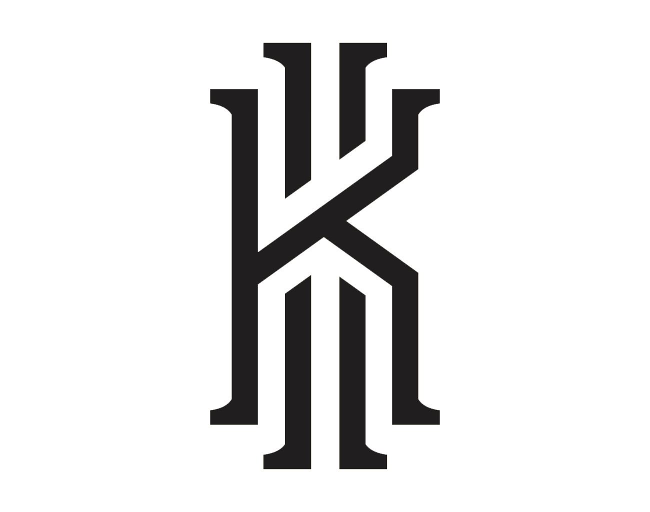
- The 2014 emblem The 2014 Kyrie Irving logo includes two letters, “K” and “I”, which look even more like Old English initials than his first emblem.
- At least, they do not resemble the typical sleek typefaces used in most contemporary logos.
- The letter “I” is placed behind the “K”.
- Taking into consideration the success of the first logo, it was perfectly understandable why the sports company decided to preserve the logotype unchanged for the second product in the Irving’s signature line, the Nike KYRIE 2 shoe.
- Font We can hardly talk about an independent typeface, in this case.
- There are only two letters, none of which belong to an existing font.
- Designers created these characters from scratch.
- Color Typically, the Kyrie Irving logo is reproduced using the combination of black and white (either a black monogram on the white background, of vice versa).
- This is arguably the most beneficial choice in case of intricate emblems like Irving’s as it provides great contrast and excellent legibility.


Leave a Review