Konica Minolta logo and symbol, meaning, history, PNG
- Download PNG Konica Minolta Logo PNG Konica Minolta, Inc. is a technology company headquartered in Marunouchi, Chiyoda, Tokyo, Japan.
- It has offices in around 50 countries.
- Meaning and history 1937 The original Minolta logo featured the brand’s name in an unpretentious, yet unique script.
- The uneven strokes and shapes implied that the word had been written by hand, which added personal touch.
- They also became more even and less individual.
- The word “Minolta” below now featured a more generic sans.
- The type was pretty light.
- The distance between the “L,” “T,” and “A” was very small.
- This approach made the design more compact and added a unique touch.
- 1981 The white lines on the globe mark grew somewhat thinner, while the wordmark grew slightly larger.
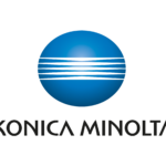
- 2003 In 2003, the company merged with Konica to form Konica Minolta.
- The new Konica Minolta logo has added a gradient to the globe mark.
- Also, it has introduced a new, distinctive type, which symbolizes “the fresh surprises that we offer to customers,” as Konica Minolta’s official website explains.
- They stand for the company’s know-how in the field of imaging.


Leave a Review