Klasky Csupo logo and symbol, meaning, history, PNG
- Download PNG Klasky Csupo Logo PNG Klasky Csupo, Inc. is a Hollywood-based multimedia entertainment animation studio and production company.
- The Nickelodeon’s Rugrats has been often named their best-known project.
- Meaning and history While you can come across about five versions of the Klasky Csupo logo, they all look pretty similar.
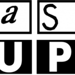
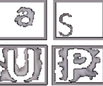
- 1981 – 1999, 2001 – 2002, 2008 – 2016 The original logo features a double-line set of boxes each housing a glyph from the company’s name.
- Taking into consideration that the rest of the logo is black-and-white, the letter stands out.
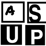
- While it may look very much like the original, it has a couple of notable differences.
- In the previous version, the word “Klasky” was almost impossible to grasp at first glance (unless you were already familiar with it).
- This time, it is was by far easier to grasp, although it still was on the verge of being a random set of letters rather than a single word.
- The word “Csupo,” by contrast, started to look so serious that almost nothing reminded of the company’s artistic roots.
- This version has been used simultaneously with other ones (for instance, it can be seen in the 2016 RoboSplaat!, although other projects of that era feature an updated logo).
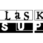
- 2003, 2008, 2016 – present The word “Klasky” has grown bolder and lent some of its playfulness to its “Csupo” neighbor.
- The writing “INC.” disappeared leaving the design more modern and easier to grasp.
- While the Klasky Csupo logo still has a “film” reminiscence and looks playful, we cannot say it could win the first prize in a legibility competition.
- Video




Leave a Review