Kit Kat logo and symbol, meaning, history, PNG
- Reese Candy, which is part of Hershey, while Kit Kat sold in other countries is made by Nestlé.
- 1935 — 1937 The brand was established as Rowntree’s Chocolate Crisp in 1935 and had its first logo designed in the same year.
- The “Chocolate Crisp” part was written in all capitals of a bold and elegant serif typeface, while the “Rowntree’s”, arched above it, used a more lightweight and delicate font.
- 1937 — 1945 The product was rebranded in 1937, adding the “Kit Kat” part to its name.
- The solid red background and the “Chocolate Crisp” parts remained untouched, while the arched “Rowntree’s” inscription was replaced by a horizontally stretched white oval with red “Kit Kat” lettering on it.
- The new logotype was executed in a bold custom sans-serif with the lines of both “K”s elongated.
- The “Kit Kat” logotype was placed right on the blue packaging, written in elegant serif capitals.
- 1947 — 1988 The redesign of 1947 brought back the original red and white color palette, enlarging the white oval with the “Kit Kat” inscription and placing it in the middle of the composition.
- The additional lettering was placed under and above the main element, written in capitals, and executed in a traditional serif font.
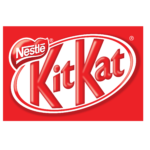
- 1988 — 1995 The brand was acquired by Nestle in 1988, and all the additional lettering was removed from the logo in the same year.
- Now the white “Nestle” logotype in its custom typeface was placed above the oval, which gained a double red and white outline.
- 1995 — 2004 The contours and lines of the logo were refined in 1996, making the major inscription bolder and more elegant.
- The red of the Kit Kat logo became more intense and bright, which made the whole emblem look confident and professional.
- 2004 — 2017 In 2004 the oval was placed a bit diagonally and some gradient shades were added to the logo.
- Old packages (Rowntree’s) Because of the ingredients shortage resulting from the World War II, Rowntree modified the recipe.
- A brand-new package was introduced, blue with bold letters.
- Symbol When the brand was purchased by Nestlé in 1988, the logo was modified once again.
- Since 2002, the packages of the Kit Kats sold by Hershey also feature the ellipse shape, like Nestlé Kit Kats, yet the color scheme is slightly different, as well as the glyphs.
- Font One of the features differentiating Nestlé Kit Kat logo from the Hershey’s counterpart is the typeface.
- Nestlé uses a more playful and friendly type with two different “K’s” and a 3D effect, while on the Hershey’s product package, the letters are flat, bold, and rather straightforward.





Leave a Review