Kenworth logo and symbol, meaning, history, PNG
- Download PNG Kenworth Logo PNG The history of the Kenworth logo reflects the changes in major logo design trends.
- It was founded in Seattle, Washington, as a car and truck dealership.
- The original name was Gerlinger Motors, which reflected the names of the two co-founders, brothers George T. and Louis Gerlinger, Jr. Two years later, the brothers made a truck with a more powerful inline six-cylinder engine.
- The company has changed several owners.
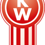
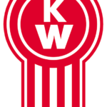
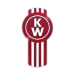
- The core of the design is the combination of the letters “K” and “W” placed one above the other.
- There is also black trim encircling the badge.
- Also, the logo has lost the plate with the word “Kenworth” and the black trim, both of which work for the same overall effect.
- The word “Kenworth” can be added below the badge.
- While the first one reflects only the brand’s heritage, the second one (the corporate logo) establishes a link with the parent company.
- The first logo looks pretty much like the 1956 version described above.
- Here, the lettering “Kenworth, The world’s Best” in black has been added to the right of the badge.
- To the right, there is a red square housing the name of the brand in huge white letters.
- Below, the writing “A Paccar company” in black can be seen.
- Colors The Kenworth logo has always featured silver and red or white and red.





Leave a Review