Kayak logo and symbol, meaning, history, PNG
- Download PNG Kayak Logo PNG Kayak is the name of one of the world’s most famous travel agencies, which was established in 2004 and is headquartered in the United States.
- Today the company operates online across the globe and has its website available in more than 10 international languages.
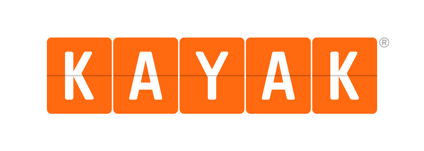
- Meaning and history 2004 – 2017 The very first Kayak logo was more similar to the airport flights board, showing departure and arrival.
- The orange square with the white sans-serif letters on them was a bit higher than today’s ones.
- They also had a thin gray horizontal line crossing all squares in their middle.
- Another difference was in the corners of the solid orange figures — they were rounded, just like the corners on the letters of the Kayak logotype.
- 2017 – Today The visual identity of one of the most popular travel online agencies in the world is minimalist, yet super modern and instantly recognizable due to the use of a bright color palette.
- The Kayak logo was first designed in 2004, and only slightly modified in 2017, as it was a perfect concept from the very beginning.
- The logo is composed of a wordmark, where each letter in white is placed inside an orange rectangle.
- On the original logo version the inscription was executed in a smooth and rounded sans-serif typeface, and there was a very thin horizontal line in gray coming through the whole logo and making it look like the flight tableau in the airport.
- After the redesign of 2017, the gray line is gone and the typeface of the wordmark became stronger and sharper.
- Now the “Kayak” inscription is executed in a bold geometric sans-serif with straight clean lines and traditionally cut edges and angles.
- As for the most important part of the Kayak logo, its color palette, the combination of orange and white symbolizes the passion and energy of the company, which main aim is to help people across the globe to travel and open new places and emotions.
- Orange is a color of movement, while white evokes a sense of reliability and loyalty, showing Kayak as a trustworthy and confident agency, able to give their clients everything they may need.


Leave a Review