Kansas City Mavericks logo and symbol, meaning, history, PNG
- Download PNG Kansas City Mavericks Logo PNG The Kansas City Mavericks’ history dates back to 2009 when the club was founded.
- At that time this ice hockey team had the name the Missouri Mavericks.
- Before the 2017-2018 season they changed their name to the Kansas City Mavericks.
- The fact is that Independence, Missouri, where the team is based, is a satellite city of Kansas City.
- Their intention was to identify themselves more clearly on a national level.
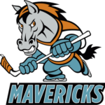
- Meaning and history 2009 — 2014 The Kansas City Mavericks logo from 2009 was composed of a funny and playful caricature of a horse in a hockey uniform, ice-skates, and with a hockey stick in its hands (worn in blue gloves).
- On the background, the delicate blue and white contour of Texas could be seen, and under the mascot emblem — the wordmark on a black banner.
- The “Mavericks” inscription in the uppercase was executed in a slightly slanted sans-serif typeface with bold lines and straight cuts, in a light blue color and thin white outline.
- 2014 — 2017 All the Mavericks’ logos are in line with their name ‒ they feature a horse.
- Their first logo which was in use from 2009 to 2014 is the image of a stallion on skates holding a hockey stick.
- The colors are light blue, orange, black and white ‒ a combination that is meant to attract attention.
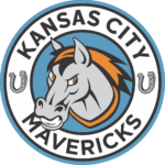
- The logo introduced in 2014 shows the horse’s head with an orange mane.
- It is framed by a circle with the word “Missouri” above and “Mavericks” below and two horseshoes on the sides.
- 2017 — Today The change of the name brought about just one revision in the logo of 2017 ‒ “Kansas City” instead of “Missouri”.





Leave a Review