Jurassic Park logo and symbol, meaning, history, PNG
- Download PNG Jurassic Park Logo PNG The term “Jurassic Park logo” may refer to several emblems featured in the original novel by Michael Crichton, as well as the movies that followed, to say nothing of the brand’s merchandise.
- Meaning and history The Jurassic Park visual identity is still based on the logo, created for the brand in 1993, but the current version of the emblem is a modernized and strengthened badge, which replaced the iconic red and black color palette with a cold metallic combination, evoking a sense of danger and sharpness.
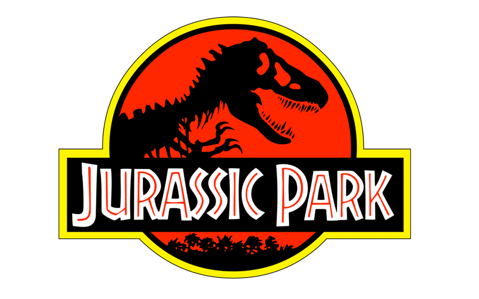
- 1993 – 1997 The very first logo for Jurassic Park was composed of a bloody-red circle in a black and yellow frame, with the dinosaur skeleton drab in black on the left side of the badge.
- The wide black rectangular banner was crossing the badge on its bottom part, featuring the same framing and having bold white lettering with red lines on it.
- 1997 – 2001 In 1997 the logo was redesigned, replacing the inscription on the badge with “The Lost World” and keeping the “Jurassic Park” as a tagline.
- As for the main part of the visual identity, its emblem, its red structure gained some black accents and a “cracked” texture.
- The outline of the badge has also been modified, and now featured three circles — two blacks and one thick yellow in the middle.
- 2001 – 2015 With the release of the third part of the famous franchise, the logo was changed again, and this time the changes were more dramatic.
- The black, red, and yellow color palette of the badge was replaced by gray and red, where gray had gradient metallic shades, and red was dark and mysterious.
- The dinosaur on this version was executed in a silver-gray scheme, and the rectangular badge — dark gray background and white and red inscription, with three diagonal lines, stylized as claw scratches, placed on the right from the wordmark, and standing for the third part of the franchise.
- 2015 – 2017 In 2015 the red background of the emblem was changed to a gradient blue, and the badge became three-dimensional now.
- The “Jurassic World” lettering on the banner gained shadow, as well as the dinosaur skeleton, executed in dark gray.
- 2018 The redesign of 2018 was about the color palette again, now the dark three-dimensional badge is executed in a monochrome palette with gradient gray and black shades and a white wordmark.
- 2022 How did the original emblem appear?
- All this seems ridiculously simple: just a book and a piece of tracing paper.
- Using the Tyrannosaurus Rex skeleton drawn by Chip Kidd as the base, she altered the structure of the bones, making them not so thin and long.
- Collora put the Tyrannosaurus inside a circle shape and placed the wordmark over it.
- At last, there was a string of palm trees below the wordmark.
- Other colors seen in the Jurassic Park logo include yellow and its shades, blue, and grey.
- Video


Leave a Review