Contents
Jojo’s Bizarre Adventure logo and symbol, meaning, history, PNG
- Download PNG Jojo’s Bizarre Adventure Logo Jojo’s Bizarre Adventure is the name of a famous anime series, created by Hirohiko Araki.
- Meaning and history As for the original Jojo’s Bizarre Adventure manga, its visual identity has been pretty modest, with just one redesign over the years, but the anime’s logo was refreshed and redrawn several times, and its last version is completely different from all the iconic Jojo’s badges we used to know.
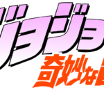
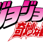
- 1993 – 1994, 2000 – 2002 The logo, designed for Jojo’s Bizarre Adventure in 1993 featured a light pink Japanese lettering in a thin black outline, placed above narrowed red hieroglyphs.
- Though the color palettes of the two versions were alike, the style and mood varied a lot.
- 2012 – 2018 In 2012 the English version of Jojo’s Bizarre Adventure logo was redesigned according to the original Japanese one, so now the bold gradient pink “Jojo’s” lettering with the first letters enlarged and their lines a bit elongated, was placed above an outlined and italicized “Bizarre Adventure” in red and white.
- 2012 – 2013 For “The Animation” series the logo of the franchise was slightly refreshed a few months later in 2012, by adding a purple italicized tagline in an elegant yet bold serif font under the main emblem.
- 2014 – 2015 With the release of “Stardust Crusades” Jojo’s Bizarre Adventure visual identity was changed again.
- The additional lettering was placed under the emblem, executed in a bold yet narrowed and italicized sans-serif typeface where the gradient gray letters featured a thick black outline.
- 2016 In 2016 the “Diamond Is Unbreakable” was released, and the bottom line of the logo was changed again.
- 2018 – Today The redesign of 2018 brought a completely new visual identity concept to the famous anime.
- The new “Jojo” lettering in all capitals is executed in an elegant serif font and has solid letters placed pretty far from each other.
- The logo is underlined by two lines of additional text — the upper one in English, written in black, and the bottom in Japanese, executed in fuchsia.
- Font and color The “Jojo” capitalized inscription from the new franchise’s visual identity is executed in a sleek and bold serif typeface, which looks pretty similar to such fonts as Pradell Bold and Mireille Medium, but with contours slightly modified.
- As for the color palette, Jojo’s Bizarre Adventure logo is based on a combination of fuchsia and black, which evokes a sense of passion, mystery, and power.


Leave a Review