Jacksonville Jaguars logo and symbol, meaning, history, PNG
- Download PNG Jacksonville Jaguars Logo PNG Jacksonville Jaguars is one of the few teams that are not fond of changing their logo very often.
- They design one and stick to it for many years, making it familiar and recognizable for fans.
- To some extent the team owes its name to the jaguar who resided at the Jacksonville Zoo at that time.
- They are colorful and strong ‒ proper emblems for the “Jaguars”.
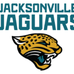
- It was an image of a jaguar head depicted in gold with black stripes.
- The jaguar was snarling.
- To make the logo more colorful and impressive the tongue was of teal color.
- Interestingly enough, it was the idea of the owner’s wife.
- The image became the team’s identity for the next 17 years.
- Each fan who attended the game was given teal-colored candies.
- Soon the people’s tongues turned teal and looked like on the team’s logo.
- 2013 — Today In 2011 a new owner bought the franchise.
- It was very much like the old logo.
- The new cat is cool.
- At first sight, it is the same gold jaguar head with the same teal tongue.
- The sharp lines are gone.
- They seem alert like ears of any real jaguar should be.
- The eyes are more “alive”.
- Color Staying true to the unique combination of the colors that has always distinguished the Jaguars, i.e. black, gold, teal and white, the franchise has reconsidered the coloring of the jaguar head.
- The club sometimes represents its logo against a dark background ‒ either black or gold or teal.





Leave a Review