JAC logo and symbol, meaning, history, PNG
- Download PNG JAC Logo PNG JAC is a Chinese brand of the commercial trucks manufacturing company, which was founded in 1964.
- The company is owned by the government of China and produces over 500 thousand vehicles yearly.
- Meaning and history The JAC visual identity underwent a major redesign in 2016.
- For the most part of the company’s history, its logo was composed of a wordmark and an emblem on its top.
- The wordmark in red featured a modern smooth typeface with an open horizontal bar of the letter “A”.
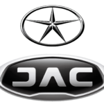
- The emblem depicted a thin five-pointed Star, enclosed in a horizontally placed oval frame.
- The color palette was a traditional monochrome with a bold accent on the red nameplate.
- It was a strong visual identity, celebrating the confident and powerful company and showing its values of heritage and roots.
- The redesign of 2016 brought a futuristic style to the JAC logo.
- The new version is composed of a wordmark enclosed in an oval medallion.
- The new typeface features simple yet bold and strong lines.
- The color palette of the JAC logo includes silver and black.
- There are several tones of silver-gray color in order to create a three-dimensional effect.
- The JAC logo is modest and minimalist yet strong, brutal and very modern.


Leave a Review