Intel Inside logo and symbol, meaning, history, PNG
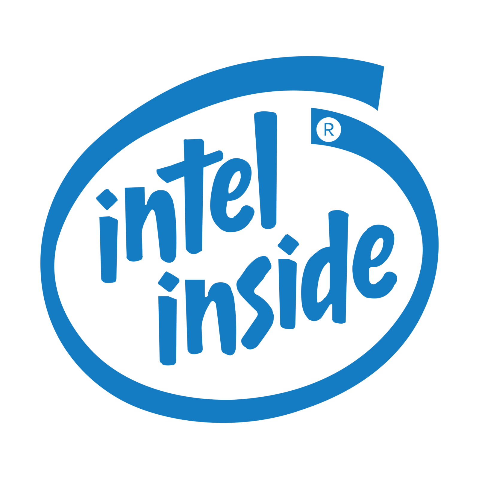
- Download PNG Intel Inside Logo PNG The Intel inside logo has gone through not less than ten modifications.
- Meaning and history The most interesting point about the logo is that it didn’t always follow the parent company’s logo.
- 1991 The original logo featured the name of the brand written not horizontally but diagonally, which provided an upbeat optimistic touch.
- There was also a version where letters looked as if they had been written by hand using blue paint or crayon.
- This effect was even more pronounced in the case of the swirl going round the name – the small white gaps made its edges slightly uneven, like when you draw with paint or crayon and the color is scarce 2002 The way the word “Intel” was written was modified to copy the iconic 1968 Intel logo, with the lowered “e.” The emblem had more breathing space, which made it look lighter.
- 2006 Only the name of the parent brand remained inside the swirl, while the word “inside” was now placed below.
- Due to this move, the company eventually had a uniform Intel logo with a possible “inside” addition.
- In the 2006 version, this word is rather small and placed on a dark blue background.
- 2009 A futuristic gradient background was introduced, while the emblem was now oriented horizontally.
- 2014 Following the update of the parent company’s visual identity, the font on the word “inside” was modified from Neo Sans Intel to Intel Clear.
- 2015 The microscheme turned blue.
- It could now be seen not only above the wordmark but surrounded it.
- 2020 The Intel inside logo grew more minimalist, and thus, more in line with current design trends.
- The structure preserved but the tiny details of the microscheme disappeared.


Leave a Review