Independence Bowl Logo
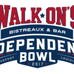
- Download PNG Independence Bowl Logo PNG Meaning and history 1993 – 2001 The current Independence Bowl logo was adopted in 2017 when Walk-On’s Bistreaux & Bar became the official sponsor of the bowl game.
- The original design of the Independence Bowl logo was based on a patriotic symbol, an Eagle, executed in a blue, red, and white color palette, with a pattern of the American national flag.
- The burg was drawn above the light brown rugby ball and underlined by an arched blue inscription with its bold title case letters written in a smooth and elegant cursive serif typeface in a light and soft shade of blue.
- 2002 – 2005 The redesign of 2002 made the bird more solid and modern, removing the pattern of the American flag from its wings and replacing it with bright blue color.
- The bird was now depicted in profile, facing to the right, and set above the red ribbon, with the white uppercase lettering, executed in a narrowed and bold serif typeface.
- The dark brown rugby ball was placed horizontally at the bottom part of the logo, decorated with five white five-pointed stars.
- Now it was a horizontally placed rugby ball in a yellowish-brown and white color palette with the three-leveled inscription placed over its white part.
- The upper line of the lettering featured an emboldened blue and yellow PetroSun logotype in a simple sans-serif typeface, with the stylized bright sun on the letter “U”.
- Now the color palette featured a fresh and classy combination of blue and red, set on a white background.
- As for the text, the upper “Advocare” lettering was executed in a fancy and smooth slightly italicized serif font, while the “Independence Bowl” still used its serif typeface, but with the contours softened.
- 2013 The sponsor and the color palette remained the same, while all other elements of the logo were refined in 2013.
- Now it was a sharp crest overlapping the rugby ball with its top part and having a horizontal blue ribbon with the Advocare logotype set in the middle.
- The word “Independence” was removed from the badge and now under the sponsor’s wordmark, there was just one bold red “Bowl” set in all capitals of a massive and shadowed serif typeface.
- The rugby ball was back to the logo was the main element, but this time it featured a military pattern in a blue color palette.
- The upper part of the ball featured an arched sans-serif sponsors wordmark, placed above the white image of a duck.
- As for the “Independence Bowl” inscription, it was also arched and placed in two levels on a bright red banner in a double blue and white outline, overlapping the bottom part of the blue rugby ball.
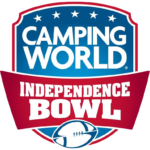
- 2015 – 2016 The smooth and fancy crest replaced the old logo in 2015.
- With Camping World as the new sponsor, the badge was redesigned in a very elegant yet powerful way.
- The crest featured a gradient blue shade as the background, five white stars along the upper part of its red and white framing, a white enlarged Camping World logotype, and a sharp red banner with the “Independence Bowl” inscription in a bold square serif font.
- The words “Independence Bowl,” which are given in white over the dark blue background, are also very visible.





Leave a Review