Incredibles logo and symbol, meaning, history, PNG
- Download PNG Incredibles Logo PNG The computer-animated film the Incredibles released by Walt Disney Pictures became very popular globally.
- It was created by Pixar Animation Studios and featured the voices of several well-known personalities.
- It was rather commercially successful, grossing $633 million globally during its initial theatrical run.
- Meaning and history While the movie was released in 2004, the history of the Incredibles logo started three years earlier with the prototype.
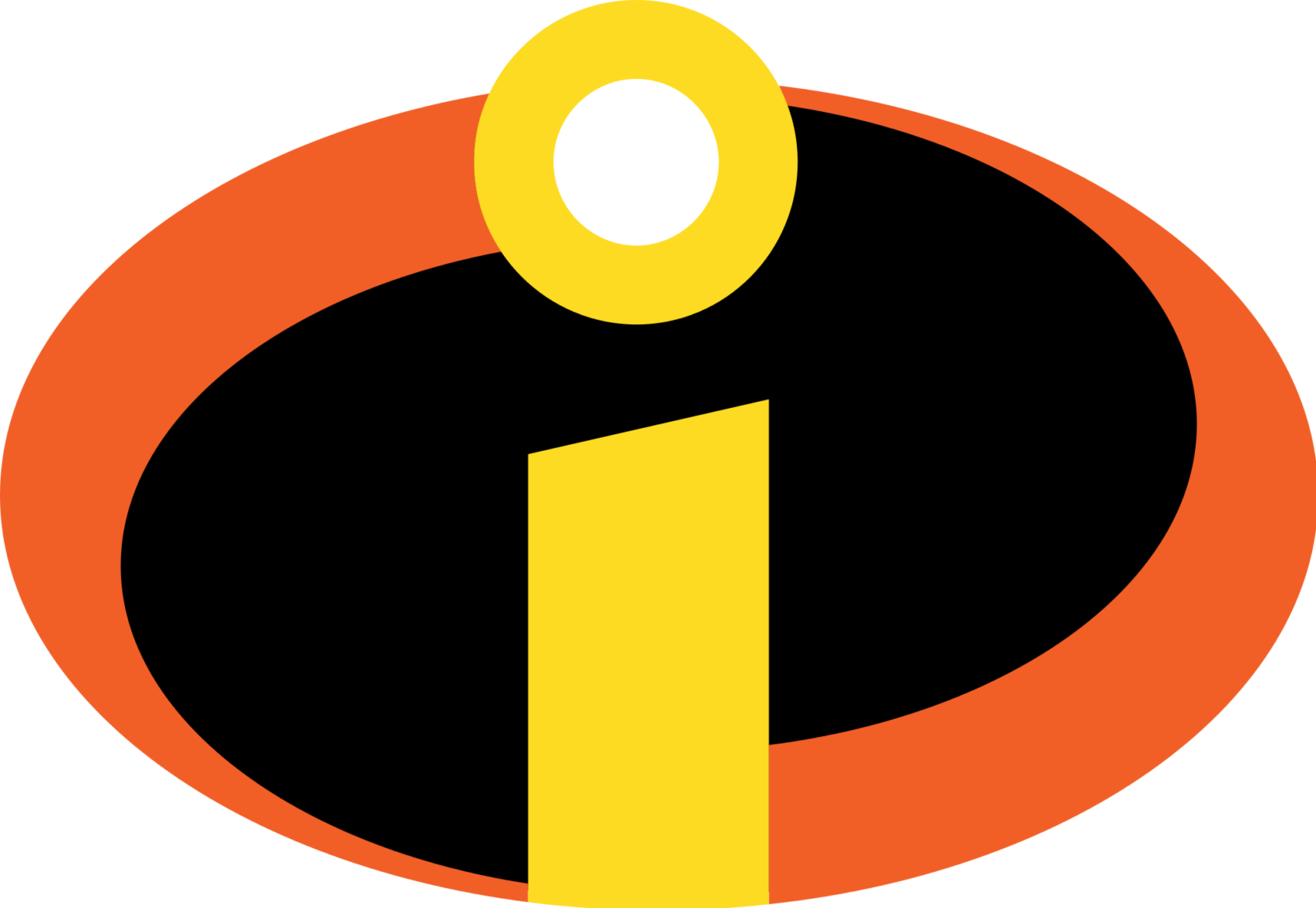
- The ellipse was black, with two orange curves on the sides.
- Vice versa, on the official logo, the left side was lower, while the right side was higher.
- Also, the dot seemed to pop out more on the prototype.
- Additionally, the first official logo featured the name of the film in a sans serif type.
- The letters were stretched vertically on the left and on the right, while the letters in the middle were lower.
- The lettering was given in black.
- You could come across a black-and-white alternative and a version, where the icon was placed inside a dark orange square.
- Colors Due to the shape of the letter “i,” the Incredibles logo resembles a candle.
- Orange and yellow are the colors traditionally associated with light and flame, while black symbolizes the darkness of the night.
- Font While the type on both the versions seems mostly the same, we should still point out that the way the letters have been stretched vertically slightly differs.


Leave a Review