Houston Rockets logo and symbol, meaning, history, PNG
- The visual identity of the Houston Rockets basketball club is famous for its “Ketchup and Mustard” logos, which were used by the team for two decades and are still remembered by its fans.
- 1971 – 1972 After the relocation of the club to Houston the new logo was designed in 1971.
- It was a caricature of a basketball player with a rocket behind his back.
- The new logo was executed in a yellow and red color palette, which later got nicknamed “Ketchup and mustard”.
- It was a very bright and funny image though it only stayed with the club for a year.
- 1972 – 1995 The redesign of 1972 brought a more modern badge to the club.
- It was a mustard-yellow basketball with white lines enclosed into a smooth red frame with a white “Houston” lettering written on its upper part.
- 1995 – 2003 In 1995 the new logo was designed for Houston Rockets and the new color palette was introduced.
- It was a red basketball with a stylized bold “Rockets” lettering executed in white and gray in a double red and blue outline.
- The ball was surrounded by a smooth blue orbit and had a funny scary rocket flying above the lettering, to the right.
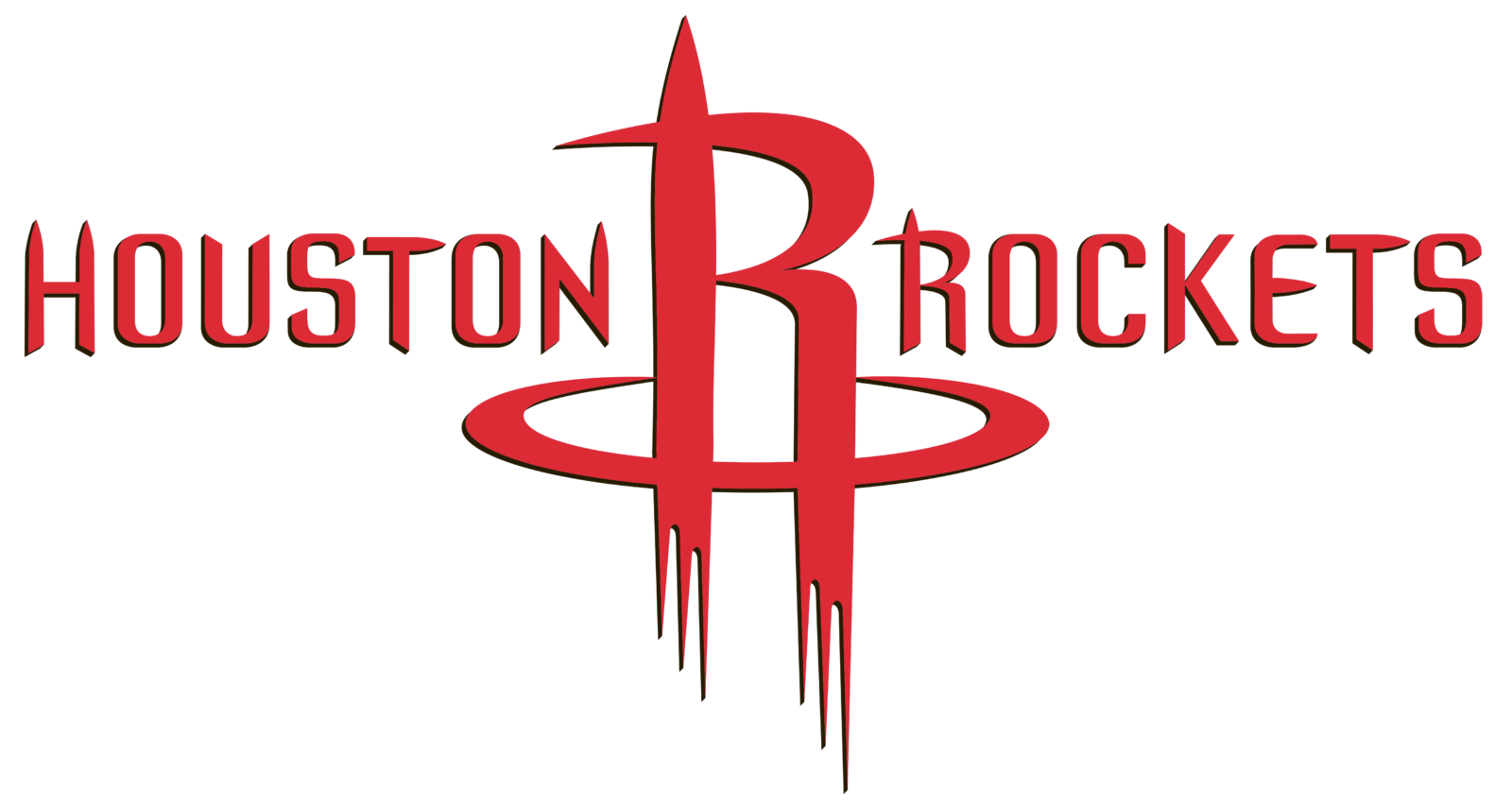
- The emblem was placed between two parts of the wordmark, executed in the same dark red color, and a fancy custom sans-serif typeface with slightly elongated and thickened ends of some letters.
- The white sans-serif lettering is now set on a wide gray and black orbit, surrounding the ball, and looks modern yet strict and strong.
- Font The distinctive letters with many sharp angles (reminding a rocket) were custom drawn specifically for the logo.
- Color There are only two colors in the regular Houston Rockets logo: red (PMS 200) and white: the red “R” appears against the white background.






Leave a Review