Hot Wheels logo and symbol, meaning, history, PNG
- Meaning and history The US toymaker Mattel started the line of die-cast toy cars Hot Wheels in 1968.
- The flame paintings on such cars were the main source of inspiration behind the logo.
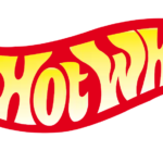
- The flame on the original logo was larger and more realistic than in any of the following versions.
- In addition to the main red flame, there were smaller orange shapes inside, like in a real bonfire.
- The shape of the white letters was also inspired by the fire.
- 1969 – 1970 The Hot Wheels logo was simplified, while the name of the brand grew more prominent.
- The white letters became larger, which emphasized the wordmark and made it better legible.
- While the glyphs preserved the original fiery style, they were redrawn.
- The old tagline was replaced by “Fastest metal cars in the world!” Also, the tagline was moved out of the flame.
- The Mattel logo was added in the lower right corner, to create a link with the parent company.
- 1973 – 1990 The words “Hot Wheels” grew yellow, while the red shape on the background grew darker.
- The shape of both the letters and the flame was slightly modified.
- We can’t say that this was a change for the better as the white and red in the previous logo created a better contrast and made the name of the brand better legible.
- The letters now featured a white and yellow gradient, which also contributed to the 3D effect.
- Also, the Mattel emblem was gone.
- 2004 – 2010 The updated Hot Wheels logo looked sleeker, more streamlined than its predecessor.
- Yet, the designers achieved this effect without dramatically changing the overall style.
- Also, the shape of the right part of the emblem became different.
- 2018 The brand unveiled a 50th-anniversary logo, where the main emblem was placed below the number 50 in large glyphs.
- Color Taking into consideration the word “hot” in the name of the brand and the flame inspiration, it’s only natural that the Hot Wheels logo has always been based on the “fiery” colors, including red, yellow, and orange.






Leave a Review