Horch logo and symbol, meaning, history, PNG
- Download PNG Horch Logo PNG Horch is the name of a former German car manufacturing company, which was opened in 1904 and closed in 1932.
- Named after its founder, the company merged with Wanderer and Audi in 1932.
- Meaning and history 1899 – 1932 The visual identity of the German carmaker of the 1900s — 1930s looks elegant and sleek.
- It has a very special art-deco mood, which makes the logo unique and memorable.
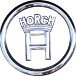
- Executed in monochrome, the emblem turned into silver when placed on the brand’s cars, and in the metallic shade, it looked stricter, yet even more modern and sophisticated.
- The Horch logo is composed of a bold letter “H” with a pattern of thin straight lines, which added structure and volume.
- In the letter, there was a thick black arch with the same white striped pattern.
- The monochrome palette of the emblem made the logo timeless and powerful, reflecting the professionalism of the company and its value of style and quality.
- Above the black arch, the wordmark was placed, repeating the architectural shape of the emblem.
- It was executed in all capitals of sans-serif typeface with letters “H”, “R” and “H” enlarged, making the logo playful and recognizable.
- When placed on the cars, the emblem was enclosed in a thin circular frame, featuring silver color.
- It made the badge crispy and fresh due to a lot of space inside the circle and around the emblem.
- 1932 – 1940 Since 1932 the company started using the Auto Union badge, as well as three other Gemma brands, that merged to form a new loud name in the automaking industry.
- The new logo was executed in a blue and white color palette and was formed by four rings, where each ring contained a logo of Audi, DKW, Horch, and Wanderer respectively.





Leave a Review