Holiday Bowl Logo
- The very first Holiday Bowl logo was created at the end of the 1970s and featured a bold and intense graphical emblem, which was not accompanied by any lettering.
- The badge was executed in the dark red, black, and white color palette, which is one of the most powerful and timeless combinations ever.
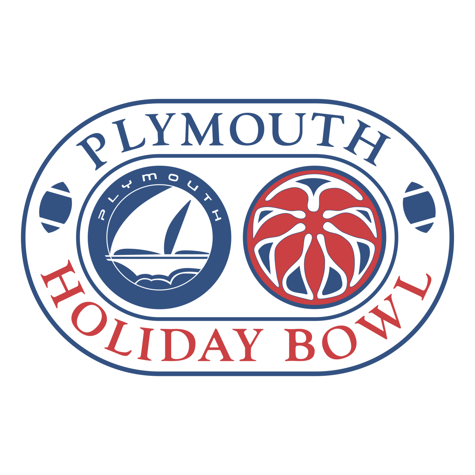
- This time the color palette used for the badge made white the main color, and switched the rectangular shape of the badge to the ellipsoid, also horizontally oriented.
- Both emblems were enclosed into a wide frame, where the “Plymouth” in blue and “Holiday Bowl” in red was written around the perimeter in the uppercase of an elegant serif typeface.
- 1998 – 2001 The sponsor was changed, as well as the logo of the bowl, in 1998.
- The bright and intense blue “Culligan” logotype was now written in cursive above the capitalized serif “Holiday Bowl” inscription in red letters with a blue outline.
- As for the red flower emblem, in this version, it was replacing the letter “O” in “Bowl”.
- The ellipsoid shape and the blue, white, and red color palette remained, though all elements of the badge were redrawn.
- The shape of the image was repeating the shape of a horizontally located rugby ball.
- As for the lettering, it was written around the wide frame’s perimeter, in red capital letters with a blue outline.
- The red seven-petal flower emblem was set on the right parts of the frame, while the left part was decorated by five strokes in red and blue, pointed to the left.
- It was executed in a dark blue and white palette, being covered with a gray rectangular banner, where the second line of the new sponsor, Bridgepoint Education, the logo was placed.
- The modern emboldened white logotype was written in a cool sans-serif font, and placed on a solid blue banner with the rugby ball at the bottom and two red flower emblems on the sides.
- The upper part of the badge was taken by a white rectangle with the blue “National University” inscription and a circular blue emblem in the middle.
- The white “San Diego” in small capitals was written under the main logotype, over the blue rugby ball.
- 2015 In 2015 the badge was redesigned again.
- The typeface and style of the lettering remained untouched, but the upper white banner was removed, and now the inscription was written over a solid blue circle, with the shade of blue darkened up and intensified.
- 2016 The logo concept of 2014 was brought back in 216, with the only difference — the inscription on the upper white banner.
- 2017 – Today It was only in 2017 that the flower on the Holiday Bowl logo was updated.
- Yet, the shape of the symbol has changed, and a white flower has been added.




Leave a Review