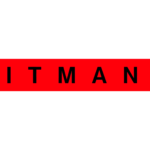
Hitman logo and symbol, meaning, history, PNG
- Download PNG Hitman Logo PNG Hitman is a video-game, created by OI interactive company in 2000.
- The game tells the story of a professional killer, who works around the world.
- There have been several chapters of Hitman released for consoles, computer operating systems, and mobile devices.
- Meaning and history The Hitman visual identity is composed of a logotype, which replaces the iconic game’s emblem, which was used since the release of the Hitman game.
- The previous logo was instantly recognizable all over the globe and was considered to be one of the strongest video-games visual identity designs ever.
- Composed of two mirroring figures, with one slightly higher than the other, the emblem has a ver-tical curved line in the center, which is going up.
- The two shapes form a silhouette of a Lilly flower in the negative space.
- The Fleur de Lys is a symbolic flower for funeral and usually placed on a casket.
- The emblem was used on all the game covers and posters, it also can be seen in various scenes of the game.
- The new Hitman visual identity is a radically minimalist logotype, which is placed inside a black rectangular frame.
- The Hitman wordmark in all capitals is executed in a strict and neat sans-serif type-face, which is one of the Helvetica family, looks close to Coolvetica with its simple confident lines and straight angles.
- The monochrome color palette of the Hitman logo is a representation of power and professionalism.
- It shows the game as the one with quality graphics and interesting story and concept.


Leave a Review