evolution history and meaning
- Download PNG Hettich Logo PNG Hettich is a brand of one of the world’s largest manufacturers of furniture fittings.
- It was founded in Germany in 1939 and today has subsidiaries in 24 countries across the globe.
- The Hettich Group is entirely family owned.
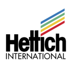
- Meaning and history The Hettich logo is a black wordmark with four parallel lines forming a rectangle above the letter I.
- The font used for Hettich logo is Rotis Sans Serif ExtraBold, which is a sans serif font designed by Otl Aicher and published by Linotype.
- The four lines are drawn in four different colors – blue, green, yellow and red – and represent four Hettich secrets to success.
- The secrets are the main brand’s values: awareness of quality, joy of innovating, constant dialogue with the customers and reliability.
- The Hettich logo is a great example of brand’s philosophy symbolism shown with minimum details.




Leave a Review