Hershey Bears logo and symbol, meaning, history, PNG
- Download PNG Hershey Bears Logo PNG The earliest Hershey Bears logo was an anthropomorphic bear playing hockey.
- Interestingly enough, this emblem was used for a very long time, until the 2000s.
- 1938 — 1943 The very first logo of the Hershey Bears was created in 1938 and stayed with the club for the next five years.
- It was a slightly naive yet nice image of a bear in a hockey uniform and with a hockey stick, executed in a brown (with red shades) color palette on a white background.
- The “Bears” in cursive was written over the white jersey.
- 1944 — 1957 The redesign of 1944 brought several changes to the Hershey Bears visual identity.
- First of all, the color palette was switched from brown to black and white, which made the badge stricter and stronger.
- Secondly, the “Bears” inscription on the jersey was replaced by a thick diagonally placed banner in solid black with the white uppercase “Hershey” in a classy bold sans-serif font written over it.
- The banner was drawn in an upright direction, evoking a sense of progress and motion.
- The “Hershey” was set in small capitals of a lightweight sans-serif typeface, above the bold enlarged “Bears” in a fancy serif font, in the title case.
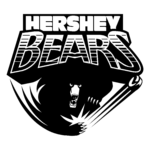
- 1988 — 2000 In 1988 the oval medallion of Hershey Bears hockey club changed its color palette.
- Now the primary color of the badge was light gray (background), while the bear, the lettering, and part of the framing were colored in burgundy, and the accents were all white.
- The bear had its white claws sharp and long, and its eyes full of danger and intimidation.
- Together with the inscription “Hershey Bears,” it’s placed inside a bold brown circle.






Leave a Review