Hartford Wolf Pack logo and symbol, meaning, history, PNG
- Download PNG Hartford Wolf Pack Logo PNG The Hartford Wolf Pack is one of America’s oldest ice hockey franchises.
- Also, it’s known as the oldest continuously operating minor-league team on the continent.
- The bird looked cool and playful, perfectly reflecting the mood and spirit of the hockey club.
- It was a red and white emblem with a stylized rooster profile picture set inside a red circular frame.
- The background and the details of the image were all white.
- It was executed in dark red and placed on a white circle enclosed into a thick black framing, where the white uppercase “Providence Reds” wordmark was written around the perimeter.
- The black framing was outlined in red from both inside and outside.
- Yellow was another color of the club’s new palette — used for the legs and the beak of the bird.
- The new logo in the black, white, and gold color palette was introduced in the same year.
- It was two-leveled lettering with a delicate funny image of a man with an elongated hockey stick set in the upper left corner of the badge.
- The top line of the inscription, “Broome”, was written in the uppercase of a classic sans-serif font, with its black letters slightly slanted.
- As for the main, “Dusters”, part of the logo, it was enlarged and executed in a narrowed italicized sans-serif font, with the bold golden letters outlined in black.
- 1980 — 1990 The logo, designed for the hockey club in 1980, was sleek and intense.
- It was a classy white, red and blue crest with two parts of inscription.
- The white uppercase “New York” was set on the upper part of the shield, underlined with white, and the diagonally set “Rangers”, which divided the main part of the crest into two triangles, white at the bottom and red on top.
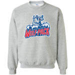
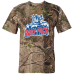
- 1997 — 2010 In 1997, the Hartford Wolf Pack logo was adopted with the image of a wolf.
- 2010 — 2013 In 2010 the club started using another logo.
- The blue and green emblem, composed of a green extra-bold letter “C” and a blue whale swimming out of it to the left with a white hockey stick, looked cool and unique, making the club stand out in the list of its competitors.
- It was slightly refined and started looking stronger due to the use of an intensified and darkened color palette.
- The wolf became even more frightening and the wordmark — more eye-catching.





Leave a Review