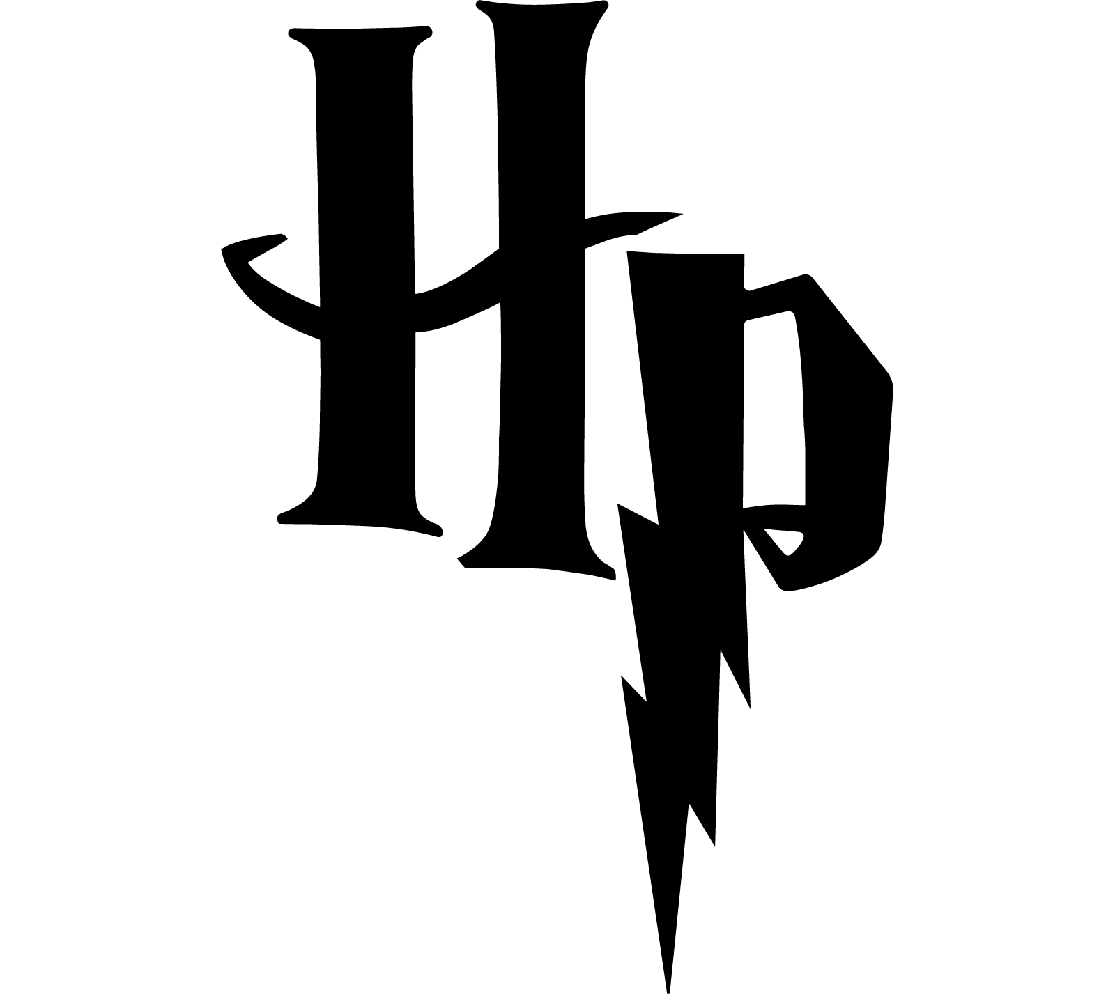
Harry Potter logo and symbol, meaning, history, PNG
- The first book, The Philosopher’s Stone, was published in 1997, while the last one, The Deathly Hallows, appeared in 2007.
- It is the flat black inscription, which is usually placed on a white background, with fancy and playful shapes of the letters, evoking a sense of mystery, magic, and adventures.
- Along with the full wordmark, there is also a shortened version, where just the “HP” letters, connected by the horizontal bar of “H”, are set in the same monochrome color palette.
- It was a bright and chic texture, which made the iconic letter look more elegant and adult.
- The tail of the “P” on this version was a bit shorter than the original one.
- 2004 – Today 2004 – 2011 The logo for Harry Potter from 2004 featured a three-dimensional sharp stylized inscription, executed in gradient silver shades with a metallic texture.
- The letters of the wordmark were placed a bit not even horizontally, with the tails of some symbols elongated and curved.
- Later, it appeared in the film.
- The second version of the symbol has remained unchanged until now, except for the color.
- Emblem Unlike many other popular logos, the essence of the Harry Potter logo is not a special symbol but the very font itself.
- It is one of the very few cases when the typeface itself includes recognizable visual characteristics that make it unique.
- Colors Judging from the fact that the logo can be seen in various colors, the color scheme cannot be considered the most important part of the Harry Potter logo.
- Some of the colors used for the image over the last few years include shades of golden, silver and black.
- Here, we can’t but mention the “lightning” in the “P” letter: this graphic element is presumably supposed to be a reminder of the “lightning” scar the main hero of the book had.


Leave a Review