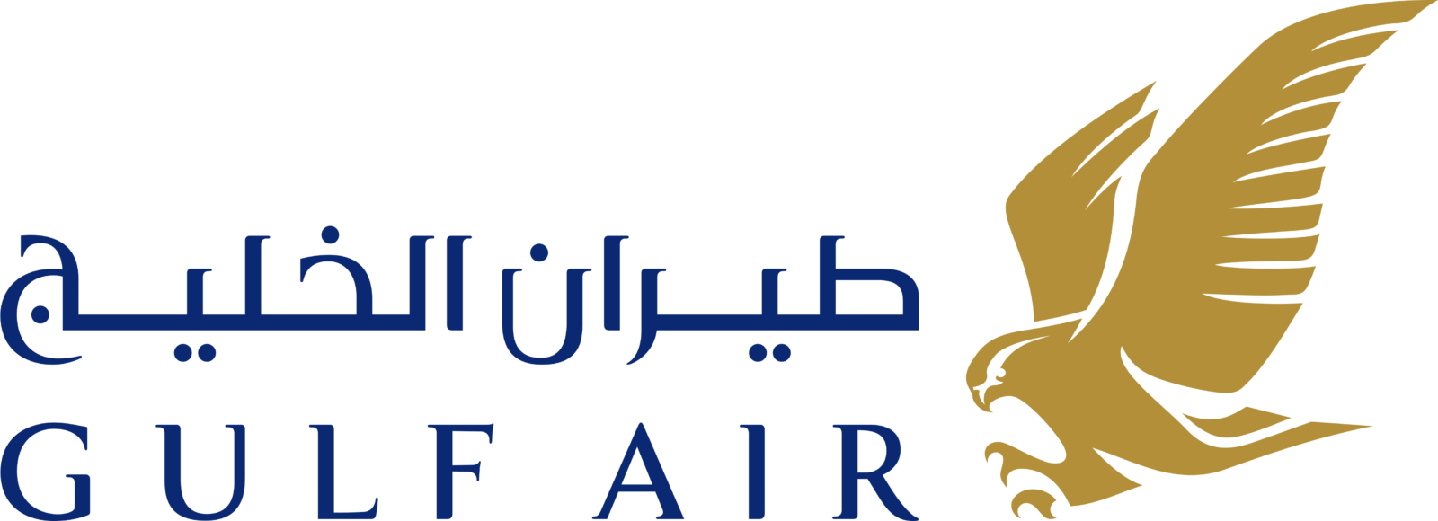
Gulf Air Logo
- Meaning and history 1950 The original version featured the old name of the airline, “Gulf Aviation,” in a slab serif type.
- 1970 The serifs were gone, the red box was replaced by a green one.
- 1973 The upper parts of glyphs in the words “Gulf Air” were green, while the lower halves were red.
- 1976 The logo grew gold.
- 1993 A bird with its wings open appeared above the lettering, which was now given in a more elaborate and lighter type.
- 2001 There has been some playing around with the shape of the bird, the type, and the color of the wordmark.
- 2010 The redesign of 2010 was all about the wordmark.
- As for the emblem, the eagle was still there, in the same style and shades.
- The bird now was depicted from another angle, and both of its sores wings are Joe see on the logo.
- As for the colors, this detail remained untouched.
- The upper Arabic line now used the same gold shade, while the bottom was made in a three-dimensional style, in two shades of muted blue color.
- Font and color The exquisite and elegant custom typeface of the Gulf Air logotype was designed exclusively for the brand but has something in common with such fonts as Aviano Flare Bold and Tinta Coated Bold, but with the contours and lines modified and slightly elongated.
- The dark blue and gold color palette of the Gulf Air logo is a reflection of quality, excellence, and precision.
- The company with the badge in these shades looks like a reputable and professional one.






Leave a Review