Green Bay Packers logo and symbol, meaning, history, PNG
- Download PNG Green Bay Packers Logo PNG The Green Bay Packers are an American football team competing in the NFL.
- The club is a member of the national Football Conference North Division.
- The club was founded in 1919.
- Before adopting the current emblem, the team had four experiments, which all featured various styles and executions, though were connected by the green color as the main in the palette.
- 1921 — 1936 The football club was established in 1921 under the name ACME Packers, and its first logo, introduced in the same year, was composed of strict bold lettering set in two levels, with both parts in yellow with a thick green outline.
- The clean and neat lines of the inscription were balanced by a dark outline, which added a sense of confidence and solidness.
- 1937 — 1955 The team was renamed Green Bay Packers in 1937, and the need for the new emblem appeared, so the square bold “GB” monogram was introduced by the club.
- The lettering was executed in a geometric typeface with the contour of the “G” horizontally stretched, and the “B” — narrowed.
- 1951 — 1955 The new color palette was introduced with the new logo in 1951.
- The bold sans-serif “Packers” wordmark in all capitals had its first letter enlarged.
- The inscription was executed in dark green with a thin yellow outline and placed on a background with a red and yellow football, which was located slightly diagonally.
- The football player in a yellow uniform with green accents was placed on a green background, with the yellow football in his hand.
- There was also a secondary version of the emblem, used by Green Bay Packers over this period — the running football player in a green and yellow uniform was located on a green background, repeating the Wisconsin contours.
- 1961 — 1979 The logo, introduced by the club in 1961 was something completely different and new.
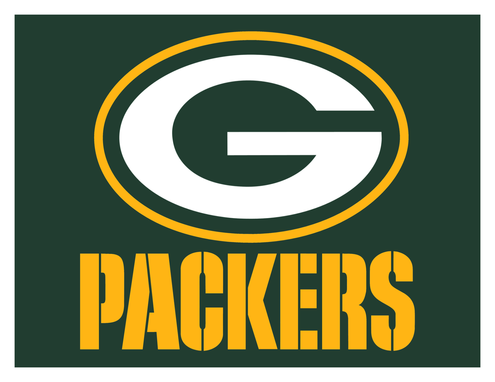
- The clean minimalist badge featured a horizontally oriented dark green oval with a white capitalized “G” placed on it repeating its perimeter.
- The letter was executed in a clean and bold sans-serif typeface with its contours neat and sleek.
- 1980 — Today With the redesign of 1989, the laconic Green Bay Packers emblem gained a new color.
- The horizontal oval is now outlined in yellow, which resembles the first logo versions of the club and adds a sense of energy and happiness to the overall composition.
- Shape The current primary Green Bay Packers logo is that same white “G” on that same green oval background, except it is lined with a yellow border.
- Most likely, it was added because this logo appears on the players’ helmets.







Leave a Review