Grand Rapids Griffins logo and symbol, meaning, history, PNG
- Download PNG Grand Rapids Griffins Logo PNG The professional American ice hockey team Grand Rapids Griffins was founded in 1996 as part of the International Hockey League.
- Meaning and history 1996 — 2002 The original logo, which was adopted in advance of the 1996/97 playing season, sported a griffin standing at his full height, with broad wings and scary claws.
- The creature had the full name of the team below.
- 2002 — 2015 In 2001 and 2002, the color scheme was slightly modified.
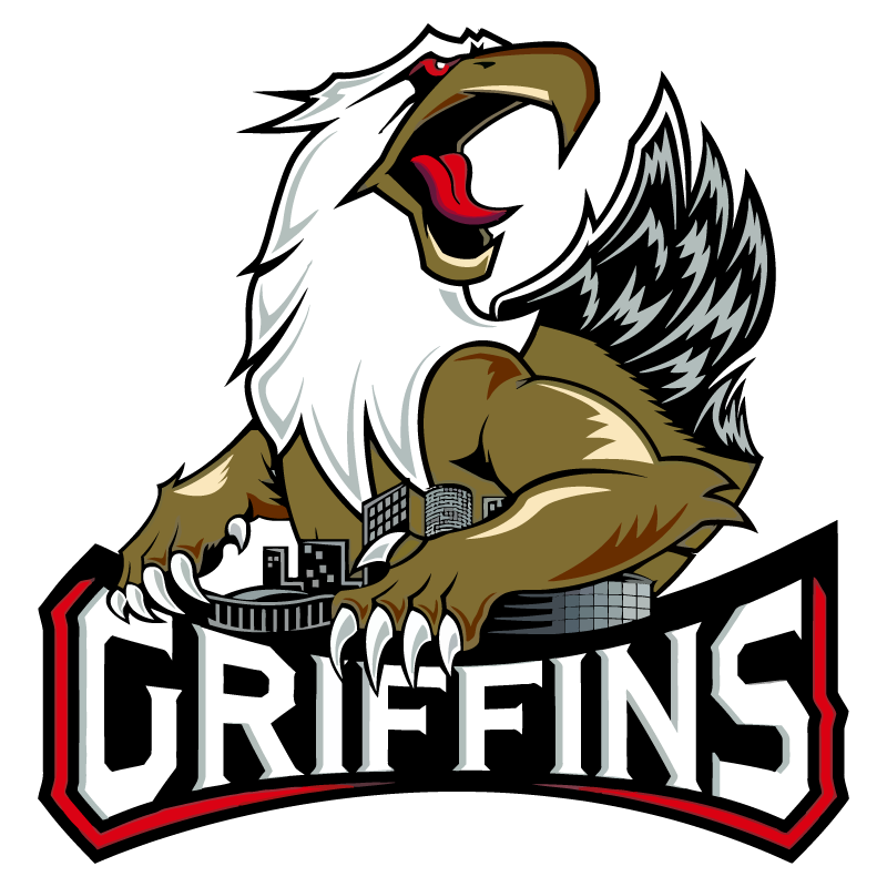
- 2015 — Today Not long before the 2015/16 playing season, an entirely new Grand Rapids Griffins logo was introduced.
- Here, only the upper part of the bird’s body was depicted, while all the rest was hidden behind the inscription “Griffins” in white.
- Colors The palette features black, red, silver, white, and gold.
- The two colors that dominate the Grand Rapids Griffins logo are gold and red.






Leave a Review