Google logo and symbol, meaning, history, PNG
- Its brightness and simplicity made the logo truly iconic and instantly recognizable.
- 1995 — 1997 The BackRub logo, introduced in 1995, comprised a simple red wordmark with two capital letters.
- 1997 — 1998 In 1997 the first logo for Google was designed, it was used only for the beta version, but became a base for all the next visual identity designs.
- 1998 — 1999 The first official logo was designed in 1998 and featured a title case inscription where each letter was drawn in one of the following colors — green, red, yellow, or blue.
- 1999 — 2013 The redesign of 1999 brought a 2D shape to the visual identity, along with the new typeface — the Catull BQ serif font, which featured elegant solid lines and sharp serifs.
- In the same year the new icon was created — the bold letter “G”, executed in the same style, but drawn using all four colors — red, yellow, green, and blue.
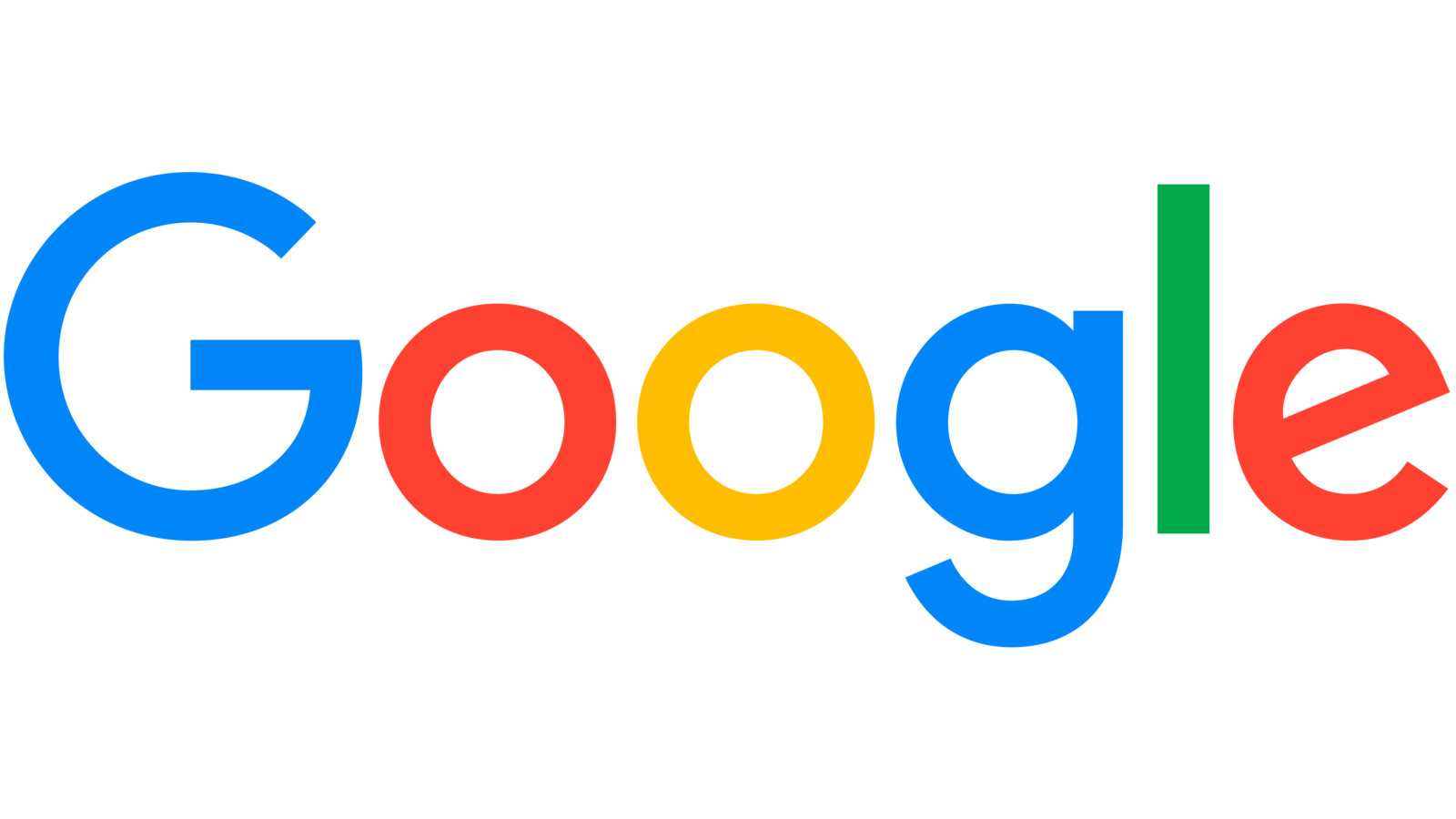
- New Logo The current Google logo is based on the sans-serif typerface, and it was unveiled on September 1, 2015.
- It uses the same color palette as the one introduced in 1998, although the hues are brighter and more consistent.
- The first letter in the Gymboree wordmark had almost the same shape as the one used in the Google favicon, while the color palette was totally different.
- “White” emblems As mentioned above, during times of great tragedy the company often uses a colorless logotype.
- In each case, the “white” logotype has exactly the same shape as the regular one, the only difference is the color scheme.
- While the earliest colorless logos featured a 3D effect, the current one, as well as the 2013 version, is flat.
- This font has a bold and streamlined shape, which makes it pixel-friendly, so it suits all resolutions; therefore, the wordmark is legible on all sorts of devices.
- Google Plus logo The Google Plus logo is based on the uppercase “G” given in the same typeface as in many other Google’s products (for instance, Google Search).
- The letter itself is white.
- The triangular shape of the emblem has stayed the same, but there has been some playing around with the colors and the wordmark.
- The icon introduced in April 2016 features brighter, saturated colors.
- Google Drive logo Both the colors and shape of the Google Drive logo have a symbolic meaning of their own.
- The favicon features a stylized map with two roads (a yellow and a white one) and three fields (blue, green, and grey).
- The palette includes two shades of orange as well as the white color.


Leave a Review