Golden State Warriors logo and symbol, meaning, history, PNG
- Meaning and history Except for the very first two versions of the emblem, the visual identity of the American basketball club has always been based on a blue and yellow color palette, which represents energy, activity, professionalism, and reliability.
- Though the badge of the team was redesigned ten times throughout history, all the versions look alike due to the bright and lively color combination, which became the club’s signifier, along with other symbols, adopted during the years.
- 1946 — 1951 The original logo, introduced in 1946 for Philadelphia Warriors, was composed of a simple yet funny image of a Native American man executed in purple lines and a yellow basketball.
- The script diagonal “Warriors” inscription is placed over the image and balanced by a yellow feather in the man’s hair.
- 1951 — 1962 In 1951 the logo was redrawn with its lines being strengthened and the color palette switched to blue and white.
- 1969 — 1971 The redesign of 1969 brought a new image to the Warriors’ visual identity.
- It was a solid yellow circle in a blue outline with an image of a blue bridge.
- “The City” inscription in blue was arched above the yellow medallion.
- 1971 — 1972 The club changed its name to Golden State Warriors in 1971, redrawing its blue and yellow emblem.
- The new concept comprised a bold yellow circle with the blue contour of the California state and a solid blue five-pointed star on it.
- The inscription was placed around the badge, with the “Golden State” arched above and written in a fancy wild-west style, and the “Warriors” in a modern sans-serif arched under the badge.
- 1972 — 1975 The color palette of the logo became brighter and some elements were redrawn in 1972.
- 1975 — 1988 The yellow circle was redrawn as a basketball in 1975.
- 1988 — 1997 The lines of the Golden State Warriors emblem were cleaned and refined in 1988.
- The lettering was executed in a fancy modern typeface with the lines of the letter “W” elongated and drawn as a lighting bolt.
- This badge stayed with the club for over a decade.
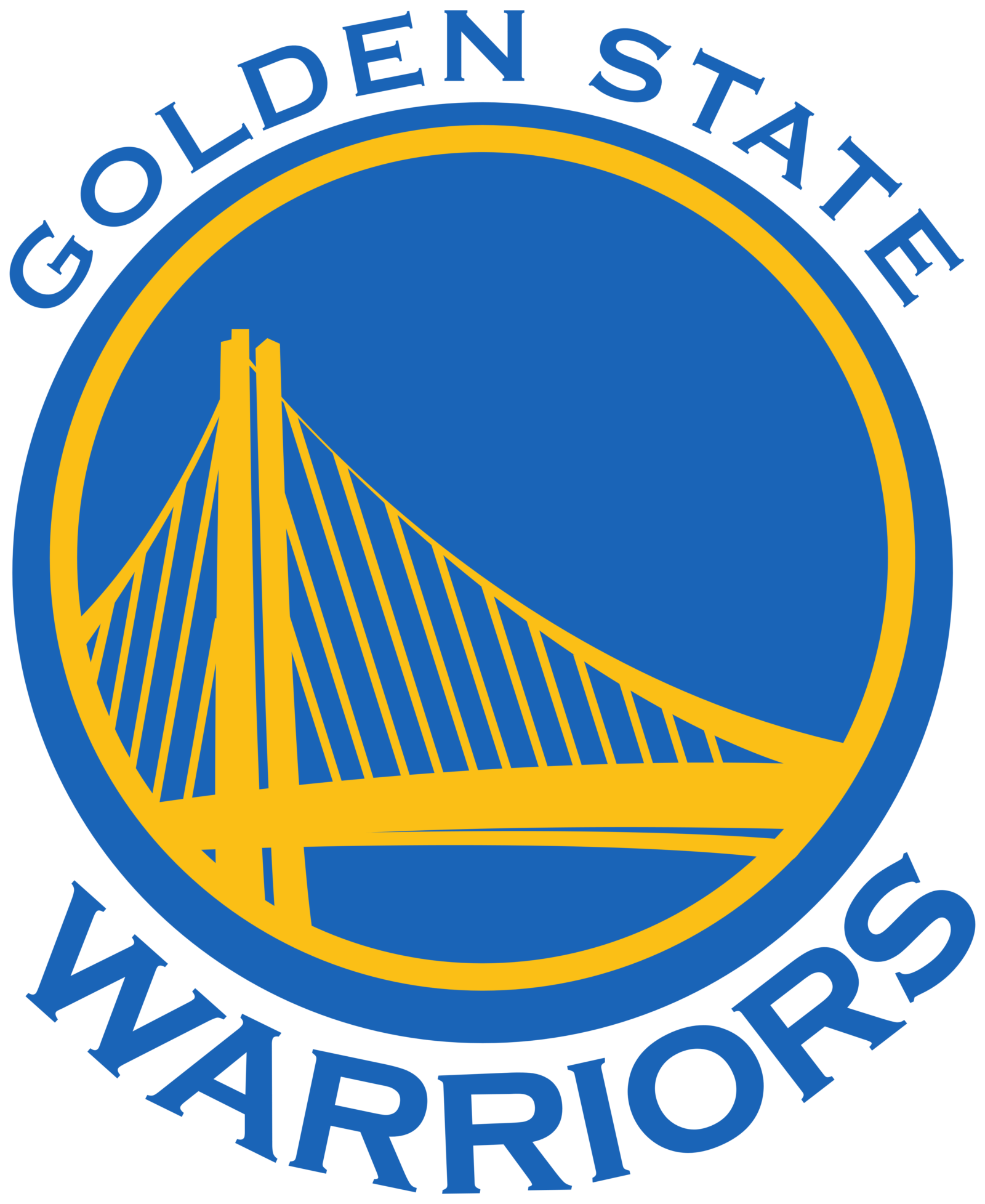
- 2010 — 2019 The redesigning of 2010 brought up a fresh insignia for the basketball team — a light blue loop medallion in a double yellow-blue outline with an elegant and sophisticated image of the bridge drawn on it in yellow lines.
- The blue wordmark in all capitals was placed on both upper and bottom parts of the medallion and executed in a classy serif typeface with wide and solid contours of the letters and delicate sharp serifs.
- 2019 — Today In 2019 the color palette of the logo was switched to a darker and a more intense one, and the typeface of the inscription was changed to a more modern and sleek serif with softened curves and playful elongated streaks.
- Font The typefaces look very much like Copperplate Medium (for the “GOLDEN STATE” lettering) and Copperplate Bold (for the word “WARRIORS”).







Leave a Review