Gold Coast Titans logo and symbol, meaning, history, PNG
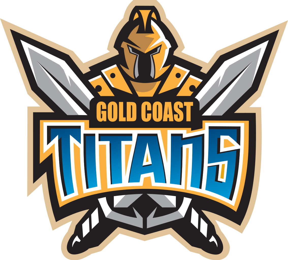
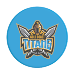
- Download PNG Gold Coast Titans Logo PNG While, technically, the Gold Coast Titans logo can be broken into the pictorial emblem and the wordmark, the two parts merge seamlessly.
- The team name was chosen two years earlier during a competition.
- The jerseys were also chosen by fans voting on the club’s website.
- At last, there’s the head and torso of a knight in golden armor.
- The logo has many small details that can be clearly seen only at larger sizes.
- When it’s small, you lose many important details: in fact, you just see the two crisscrossed swords and the word “Titans,” while the knight and the lettering “Gold Coast” disappear.
- It’s not cluttered.
- The simpler, rough level can be perceived even when the emblem is small, while at larger sizes the more complex level is revealed.
- Font The emblem combines two different typefaces.
- The initial “T” has two sharp angles on its horizontal bar, while the vertical bar is slightly bent.
- By contrast, in the case of the second “T,” the horizontal bar has regular square ends, while the vertical bar is almost straight.
- Apparently, the designer was trying to create a visual “rhyme” with the sharp swords above the lettering.
- Also, such angles provide an illusion of symmetry within the word itself.
- As for the Gold Coast Titans logo, you can see several shades of blue (gradient), gray, white, gold, and black.




Leave a Review