Ghostbusters logo and symbol, meaning, history, PNG
- Download PNG Ghostbusters Logo PNG Ghostbusters is the name of a famous American franchise, which was introduced in 1984 by Dan Aykroyd and Harold Ramis.
- The plot of the series and comics is based on a story of a team of scientists, fighting ghosts in the homes of New York citizens.
- After the release of the first movie, Ghostbusters became incredibly popu-lar all over the globe.
- The sequel was introduced in 2016.
- Meaning and history The visual identity of the famous franchise is still based on the image, created for Ghostbusters in the middle of the 1980s.
- Though with each new release — whether it’s a movie, a sequel, or an animation, the logo gets a little stylized to suit the new surroundings and backgrounds.
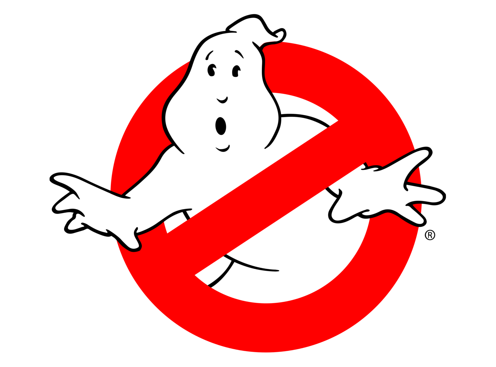
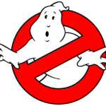
- 1984 – 2016 The Ghostbusters logo is composed of a drawing with a fun playful ghost coming out from the red circle of a Prohibition road sign.
- The image is usually placed direct-ly on a black or any other dark background, but sometimes is put into a logotype, replacing the letter “O”.
- In this case, the lettering is executed in a bold classic type-face with thick lines can and uses black color for its letters.
- The white ghost gets a thin black outline to be more visible on a white background.
- 2016 – Today For the Ghostbusters movie released in 2016, the iconic logo was slightly refined.
- The red sign got its surface vivid and glossy due to the addition of gradient shades, and a thin yet confident sil-ver outline, which is also three-dimensional.
- The black logotype in an elegant serif typeface is now changed to a bold square in-scription, with the letter “O” still replaced by the franchise’s emblem.
- The letters switched their main color from black to white and gained a thin black outline and a slight gray shadow, which elevate the three-dimensional look of the visual identity and adds dynamics and energy to the whole composition.





Leave a Review