Genoa logo and symbol, meaning, history, PNG
- The club’s brand identity is connected with the symbols of its home city, Genoa.
- It was now only the heat of the Griffin, executed in Ted and dark blue and placed on a plain white background color without any heraldic elements or crest framings.
- The creature looked sharp though funny and playful.
- And showed the progressive approach of the team.
- 1980s Later in the 1980s, the Genoa logo was changed again.
- This time the football club decided to come back to the roots, using the initial holder griffon on a crest concept but redrawn the creature more simply and stylishly and adding a golden football into its hands.
- As for the background, it was kept as on the logo from 1893, but the upper part now became a bit wider, so the Red Cross got more massive and visible, as well as the thick gold frame of the logo.
- 1980s — 1991 A few years later the griffon badge was redrawn again, and now it was truly a masterpiece.
- 1991 — 1998 The redesign of 1991 made the badge lighter and simpler.
- The griffon was still there but redrawn.
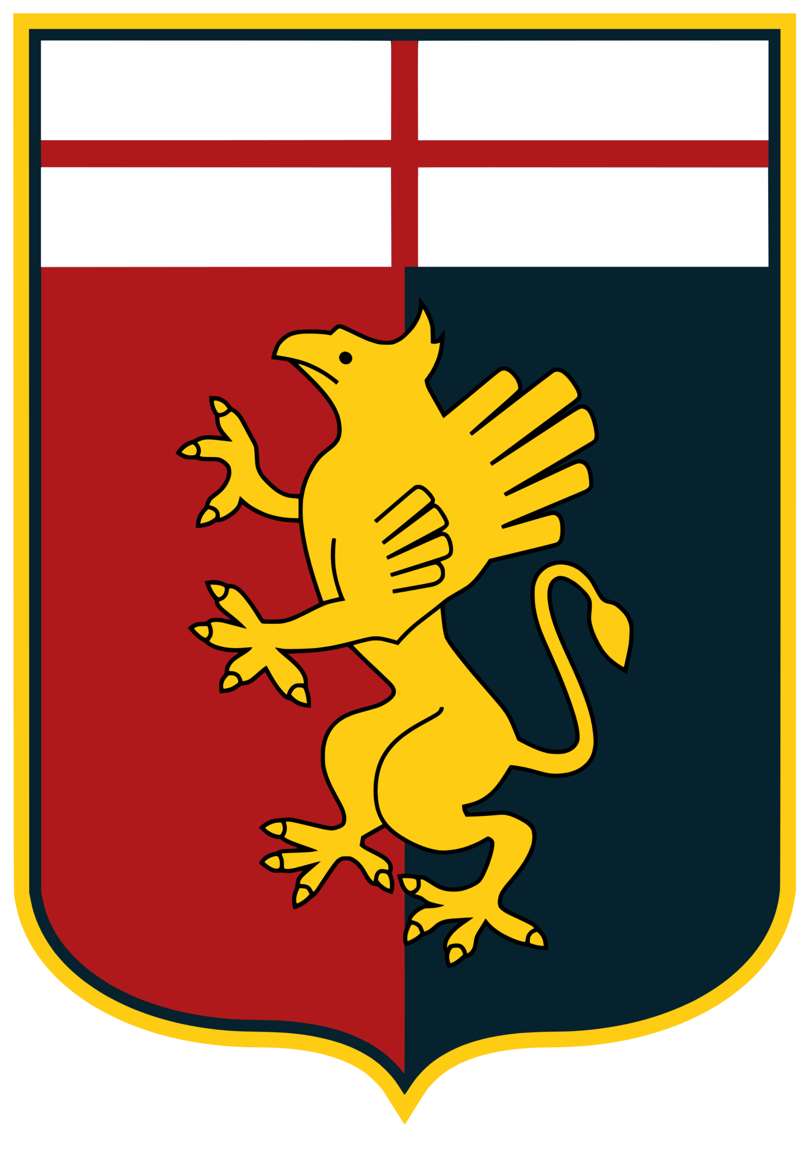
- The most prominent part of both the current Genoa logo and its previous version is a yellow creature with wings, sharp claws, and a long tail.
- That’s a griffin, which was borrowed from the crest of the city of Genoa.
- Colors In addition to the colors borrowed from the coat of arms of the city of Genoa (red, white, and gold), the Genoa CFC emblem also features dark blue and black.
- Black has been used to provide the finishing touch, while blue presumably symbolizes the sea (Genoa is a port city).





Leave a Review