Galatasaray Logo and symbol, meaning, history, PNG
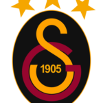
- Download PNG Galatasaray Logo PNG Galatasaray is the name of a professional football club from Turkey, which was established in 1905, and today is in the top ten of the Turkish Super Lig.
- 1905 – 1923 The original Galatasaray emblem was introduced in 1905, right after the club’s establishment, and featured a stylized red and orange badge, composed of two symbols, standing for the first Turkish letters of the team’s name.
- It was a burgundy red big letter, resembling a Latin “E” in cursive” with a small solid dot sitting on its top, and a key-like symbol in dark-yellow, or orange, placed inside the bottom part of the bigger letter.
- The emblem looked very sophisticated yet bold and modern, and its color palette has the club their “Lions” nickname, showing courage, determination, and power.
- 1923 — 1961 The redesign of 1925 changed the Turkish letters of the logo to the Latin ones, which made up a new GS monogram.
- Now the badge was composed of an enlarged yellow “S” in a thin black outline, and a red “G” intertwined with the “S” bottom part.
- The black “1905” datemark was placed inside the white circle formed by the lines of the letters.
- 1961 — 1987 In 1961 the lines of the monogram became thinner and longer, and the black outline became almost invisible.
- The black datemark was narrowed and placed a bit lower than on the previous version, leaving more white space on the emblem, and making it airy.
- 1987 — 1993 The redesign of 1987 made the letters glued again, but this time red “G” and yellow “S” had their outlines removed.
- The black “1905”, celebrating the year of the club’s establishment, was again placed in the middle of the monogram’s bottom part, written in full shapes and thick confident lines.
- 1993 — 2000 The Galatasaray logo was slightly refined in 1993.
- With the elevated color palette, the emblem of the club started looking more solid and confident, resembling the lion’s colors even more now.
- 2000 — 2001 In 2000 the club brings back its original color palette, with burgundy-red and dark-yellow shades, and placed two solid yellow five-pointed stars on top of the badge, to celebrate the wind of the team.
- As for the black datemark, it remains in its place and still used the same style.
- 2002 — 2018 The redesign of 2002 placed the monogram into an oval frame, with a very thin black contour.
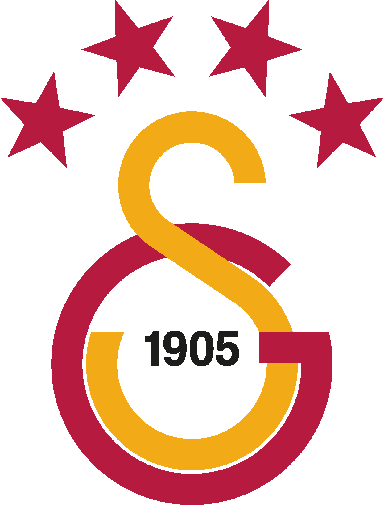
- 2019 — Today In 2019 the fourth star was added to the Galatasaray visual identity, and the color palette was slightly refined again.
- Font and color The Turkish football club prefers using its badge without any lettering, but when they have to — the Galatasaray logotype is usually executed in a strict and strong sans-serif typeface, with all uppercase letters in thick lines and solid shapes.
- As for the color palette, the Galatasaray visual identity has been using a red and yellow combination from the very first days.
- It is a scheme, representing passion and energy, along with determination, progressiveness and reliability of the club, and their willingness and ability to fight.





Leave a Review