Frozen logo and symbol, meaning, history, PNG
- Download PNG Frozen Logo PNG Frozen is the name of a Disney franchise, which was launched in 2013.
- Based on a Nobel about two girls, the book grew into a cartoon, which became incredibly popular across the globe.
- Today Frozen is one of the most successful project children, which has not only printed and cartoon editions but also toys and fashion items produced under its brand.
- Meaning and history The visual identity of the Disney’s franchise, based on the old story by Hans Christian Andersen, keeps the tender and touching the retro mood of the original story, turning it into something modern and happy.
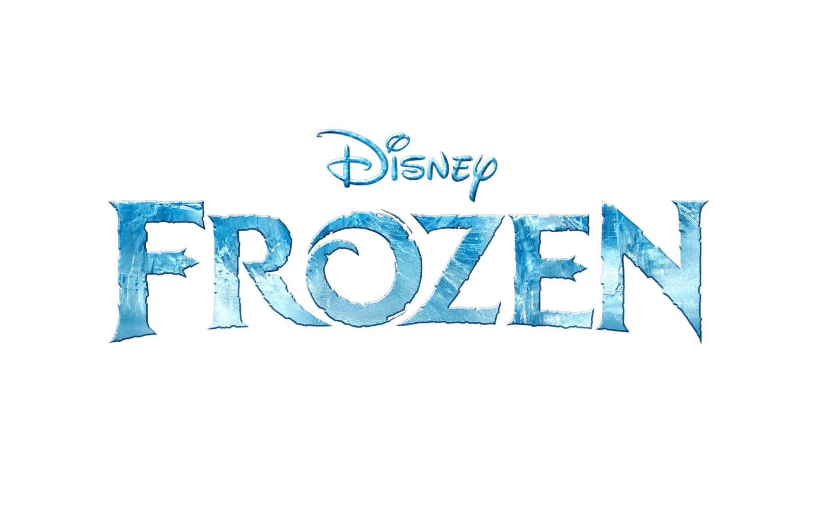
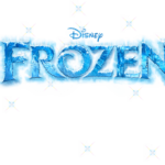
- The Frozen logo is composed of a wordmark, which is usually used on its own, but sometimes is placed into an ornate frame with the Disney logotype on top.
- The lettering of the logo is executed in all capitals with “F” and “N” slightly larger than other letters.
- The custom typeface of the inscription is based on a bold font with thin delicate serifs and thick straight lines.
- The main element of the logotype is the letter “O”, which has its contour open and a bit curved in order to look like a swirl.
- Another interesting detail about the wordmark are is the uneven edges of the letters, which make it look like a frost pattern on a window or some ice shapes.
- The Frozen logo is usually drawn in a white and blue palette, which is the best color representation of winter and cold, but sometimes the company draws it in monochrome, in order to suit more official occasions and complicated backgrounds.
- When placed on a medallion, the lettering turns white, while the background features a gradient blue with lots of light blue vignettes placed around its perimeter.
- The “Disney” inscription is always executed in the same color as the “Frozen” lettering.





Leave a Review