Frito-Lay logo and symbol, meaning, history, PNG
- The brand, established in 1961, is a food subsidiary of PepsiCo since 1965.
- The most popular label of Frito-Lay is Lay’s, Cheetos and Doritos.
- Meaning and history 1961 – 1987 Frito-Lay has not very intense, but very interesting logo evolution history.
- Composed of two letters, “F” and “L” and the nameplate under it, the logo was executed in black and red, with a white background.
- It was a stylish and progressive work.
- 1987 – 1997 In 1987 the company created a new logo, which was completely different from the first one.
- The red rectangular with rounded corners and smooth sans-serif typeface with elongated and curved lines of “F” and “Y” was elegant and bright.
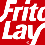
- 1997 – Present The logo we know now was designed in 1997 by San Francisco based Landor Associates bureau.




Leave a Review